by Annie | Apr 16, 2012 | Game Design
When most people think of game design, they think of the big picture. Game designers come up with the overall concept for a game – the characters, storyline, and mechanics. What many fail to realize is that game design is in the details. After the overall concept is nailed down and a prototype has been hammered out, the game designer spends countless hours fine tuning a game, making sure that every action, level, and challenge feels good and increases the amount of fun in the game. When the topic of gameplay tuning comes up, many people say that it comes down to a feeling you get when you play the game. When the feeling is right, the game is well balanced. And I agree, to a certain degree. While a big part of tuning is intangible and abstract, there are definite advantages in tying those abstractions to concrete measures. Here’s how. Set Specific Goals The most important part of tuning is to create a goal. Often, you can change a game so drastically through tuning that it can cater to completely different audiences. Thus, you must first decide on your target market and target experience. Is this a hardcore shooter for 20-year-old guys? A mind-bending puzzle game for tween girls? A social game for middle-aged folks? Setting a specific goal will help guide your tuning. As you tune, put yourself in the shoes of your target audience and see if the game has the targeted effect on you. Should the game put you on the edge of your seat? Allow you to play mindlessly? Continue over multiple days? By...

by Annie | Apr 10, 2012 | Game Design
Yesterday was my first day as a designer at East Side Games (ESG). After wrapping up our latest product, Digido Interactive decided to put development on an indefinite hiatus. Luckily, I was able to find a spot at ESG. Since September of last year, Digido and ESG have occupied a common office space, so I’ve had plenty of opportunities to eavesdrop on ESG meetings and grab coffees with ESG folks. My desk literally moved about 20 feet over. But even given all that, a first day is still a first day. And all first days are long. I remember my first day of teaching like it was yesterday. I was so busy trying to keep up with 20+ kids and simultaneously trying to teach them a thing or two that I lost over a dozen pens. I would put a pen down, then have no recollection of where it could be. By 10am, my voice was hoarse, my feet were sore, and I was planning a career change. When the end of that first day finally came, I spent the rest of the evening prepping for day two. Talk about a trial by fire. Thankfully, my first day at ESG was much less painful. Right away, I was given responsibility, creative freedom, and support. And now, at the end of my second day, I’m happy to report that this transition has gone quite smoothly so far. And I still have all the pens I started...
by Annie | Apr 6, 2012 | Game Design
When user interfaces are well designed, they fade into the background, a seemingly insignificant part of the overall product design. However, when interfaces are poorly designed, they can build walls that turn users away. Psychology is a major component of building intuitive interfaces. When we interact with a new interface, we bring with us cognitive baggage – all our previous cultural knowledge and expectations about how the interface should work. When we see something that looks like a button, we expect to be able to press it to instigate an action. However, if that image turns out to be unclickable, or if the action that follows is unexpected, we’re taken aback. In game design, this can sometimes be a good thing. After all, in order to create innovative products, you have to change users’ preconceived notions and expectations. However, if the experience is so foreign that it becomes frustrating, this can easily turn a user away. One of the best ways to find the hiccups in your interface design is to watch users try it out. They will naturally bring their cognitive baggage to the product, and if they’re able to use your product without having to focus on the interface, you’re well on your way to a solid design. Interested? Here are a couple of additional resources: The Design of Everyday Things Intuition, Expectations and Culture: Learning from Psychology to Build Better Game...
by Annie | Mar 12, 2012 | Game Design
The best way to improve your skills as a game designer is to roll up your sleeves and make a game. Not sure how? Unity is a free game engine that lets you get started quickly and easily in making your own games. If you’re new to Unity, check out these tutorials, created by VFS instructor Bren Lynne. Have...

by Annie | Mar 2, 2012 | Game Design
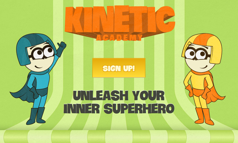
Over the past few months, we’ve been hard at work creating a new platform to allow parents and kids to track kids’ physical activity. And now, we’re proud to present to you the Kinetic Academy. Every child exercises throughout the day, whether through walking to school, attending soccer practice, or playing with the dog. Until now, all of that activity has been lost in the hustle and bustle of the day. That’s where the Kinetic Academy comes in. Through this system, kids get to unleash their inner superhero, training to increase their superpowers. As kids input their physical activity into the system, they earn points that can be exchanged for rewards. Play soccer for two hours –> 500 points –> stay up 15 minutes past bedtime. Kids get motivation to do and track exercise. Parents get an easy way to help their kids adopt healthy habits. Everyone wins. So why am I telling you about this? I would like you to be involved in the beta-testing of this website. We are in the process of making this website awesome, but now we need your help to make it better. If you’re a parent, please consider participating. Here’s how the Kinetic Academy works: Step 1: Sign up for a parent account and create a separate child account for each of your children Step 2: Add custom rewards that your child can redeem when he/she participates in physical activity (ex: have a sleepover, stay up late, etc.) Step 3: Have your child fill in the activities he/she has completed Step 4: Approve/edit the activities your child has added Step 5: Have your child redeem the points they have earned for specific rewards Try...

by Annie | Feb 23, 2012 | Game Design
Have you ever seen a game or website and thought, “Wow, that looks amazing. But what do I do?” Amidst the clutter of text or perhaps the overly minimalistic style, you as the user are at a loss for how to interact with the tool. Design is arguably one of the most interesting and creative industries out there. As a game designer, I get to make things up out of my head and then have other people play through my ideas. The downside of this creative freedom is that it’s easy to get sucked into the depths of designer myopia (i.e., nearsightedness), in which you start designing things for yourself rather than for the end user. It’s quite a common phenomenon, and we’ve all been there. I can’t count the number of times I’ve replaced text instructions with what I thought were much cleaner illustrated instructions or the times I’ve made a puzzle easier or harder to suit my personal play style. Failure to explain what I perceived to be obvious parts of my designs have often resulted in confused or frustrated users. As this Smashing Magazine article writes of web designers, “[designers] see typography and rounded corners where normal people just see websites to get stuff done on.” In other words, there’s a fine line between design and function. When designing, we need to take into account the end user’s experience, rather than focusing purely on our own design wishlists. So what do we do about it? Unfortunately, there’s no quick and easy prescription for design myopia. However, the easiest way to alleviate the issue is to continually...
