by Annie | Jan 11, 2012 | Logoland
I’ve always been entranced by logos. There’s something about the simple complexity of communicating a big message with a small image that’s always fascinated me. Good logos communicate layers of meaning, both boldly and subtly. Take a look at these 50 startup logos from...
by Annie | Jun 3, 2011 | Logoland, Typographically Speaking
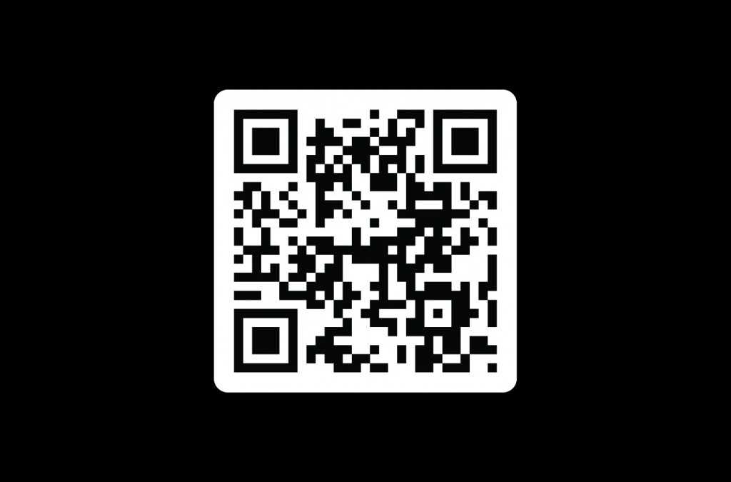
I’ve long admired people with business cards. Something about having your name and information on a card just makes things more official. So now, with our final game project submitted and Industry Night just around the corner, I finally have a card to call my own. The front comes in a few different colors, and the back has a QR code that will take you to my website. Pretty nifty,...
by Annie | Apr 7, 2011 | Game Design, Logoland
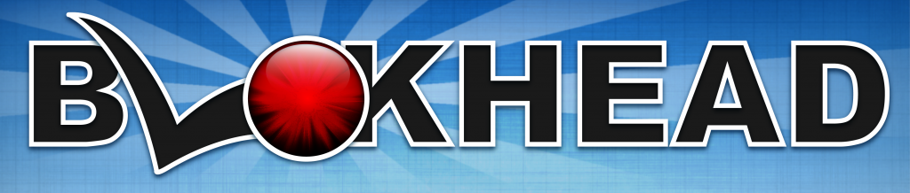
Logos have long been one of my favorite parts of graphic design. A logo needs to be simple and straightforward while simultaneously communicating layers of meaning. When designing a logo, I first think long and hard about what I want the image to communicate, filling the pages of my sketchbook with words and doodles. Color choice, typography, style, and spacing all play important roles and can drastically change the look and feel of a logo. In designing the logo for our current game Blokhead, I wanted to create a bright and strong logo that would communicate the main mechanic of throwing and deflecting balls. I wanted the logo to communicate both action and fun. The result is a logo comprised of primary colors and thick blocky letters that incorporate the L and O of Blokhead into an image of a bouncing ball. Simple, functional,...
by Annie | Dec 16, 2010 | Game Design, Illustration Station, Logoland
Making things simple can be complicated. In designing the interface and front end menu screens for my iPhone rhythm platformer concept Double Helix, I tried to communicate as much as possible with as few elements as possible. The front end for Double Helix includes a main menu screen that allows you to navigate to the game itself or to open an options or about menu. (The game screen is just a mockup, but all the interface buttons work.) Take a...
by Annie | Apr 27, 2010 | Logoland
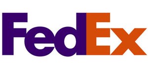
I love logos. But what I love more than logos are logos with hidden meanings. Those are the ones I look back on again and again, because they reveal an extra layer, one that makes me think about the organization the logo represents. Take a look at these famous logos. Do you see the hidden meanings? 1. FedEx Looks pretty straightforward, right? Look closely, between the E and the x. See the arrow created by the white space? Pretty clever, eh? 2. Toblerone Sure there’s a mountain, but do you see the hidden bear? 3. Goodwill At first glance, you might see half a smiley face. But look closely, and you’ll see that the smiley doubles as the letter ‘g.’ 4. Yoga Australia Typical yoga pose, though this one forms the shape of Australia. 5. Amazon We’ve all been to amazon.com, to buy everything from books to toilet paper. That’s because Amazon has it all, from A to Z, as shown by the arrow, which also doubles as a smile. So the next time you come across a logo, take a second look. Maybe you’ll find some hidden layers of meaning waiting to be...
by Annie | Mar 29, 2010 | Adchievements, Logoland
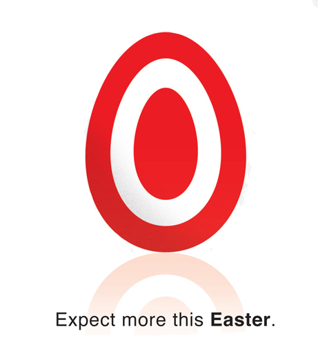
Check out Target’s Easter ad. Simple, straightforward, and memorable. The subtle but distinct variation on Target’s logo represents the iconic egg used to symbolize rebirth on Easter, and the faint reflection adds dimension to the otherwise flat logo. Great design is in the details, and Target has definitely mastered the...