by Annie | Feb 9, 2015 | Typographically Speaking
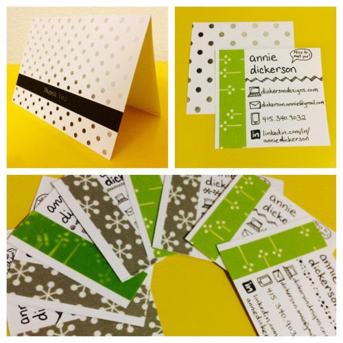
I remember my grade school cursive lessons with pride, recalling how my teacher taught me to slant my paper just so, and the first time I mastered that tricky lowercase ‘r.’ These days, handwriting is at a premium. It’s no longer taught in most schools, having been replaced by the click click click of the keyboard instead. However, there’s so much you can learn from a person’s handwriting. And that’s why I decided to upcycle some old thank you cards to create handwritten business cards. Time consuming, yes. But a chance to make a memorable first impression and stand out from the sea of glossy and printed cards. All it took were some old greeting cards, scissors, washi tape, and a decent amount of patience. But now each time I hand out a card, it’ll mean something more to me, and I’ll be exposing a little more of who I am through those carefully handwritten letters....
by Annie | Jun 3, 2011 | Logoland, Typographically Speaking
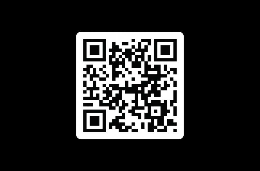
I’ve long admired people with business cards. Something about having your name and information on a card just makes things more official. So now, with our final game project submitted and Industry Night just around the corner, I finally have a card to call my own. The front comes in a few different colors, and the back has a QR code that will take you to my website. Pretty nifty,...
by Annie | Feb 18, 2010 | Typographically Speaking
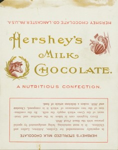
Who doesn’t love a Hershey’s bar? The creamy milk chocolate is a must-have for any s’mores sandwich and makes a delightful anytime snack. Hershey’s bars were originally wrapped in white paper with scripty gold lettering. Through the years, dark paper was introduced due to an accusation of copyright infringement, and the iconic block lettering was added. Hershey bars were just 5 cents through the end of 1969. Then, they doubled to 10 cents, and the price has been climbing ever since. Notice on the earlier versions that the chocolate bar was dubbed a “nutritious confection” and a “nourishing food.” Those labels were dropped in the 1930s, and after the nutrition label was added in 1973, no one can claim that the bar is very nutritious. It is, however, undeniably...
by Annie | Jan 12, 2010 | Logoland, Typographically Speaking
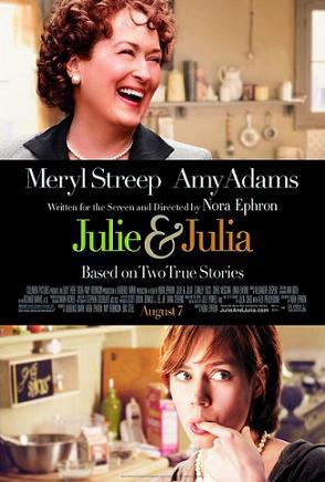
I recently watched the book-turned-movie Julie and Julia, a very fun movie based on an inspirational story that brings together modern day young professional Julie Powell with famous TV chef Julia Child. The title screen of the movie incorporates a scripty ampersand, representing the unity of time periods, locations, and styles. So I got to thinking, where did the ampersand come from? According to Wikipedia, the word ampersand comes from the phrase “and per se and,” meaning “and [the symbol which] by itself [is] and.” I recall hearing in high school Latin class that the ampersand comes from the Latin word “et,” meaning “and.” In fact, you can trace the evolution of the symbol back to Old Roman cursive, in which the letters E and T were sometimes written together. These days, you can find the symbol practically anywhere: 1. In logos 2. In clothing and accessories 3. Around the house What was once a quick shorthand symbol has now become an icon of class, unity, & enterprise. Bravo, ampersand....
by Annie | Jan 6, 2010 | Adchievements, Illustration Station, Typographically Speaking
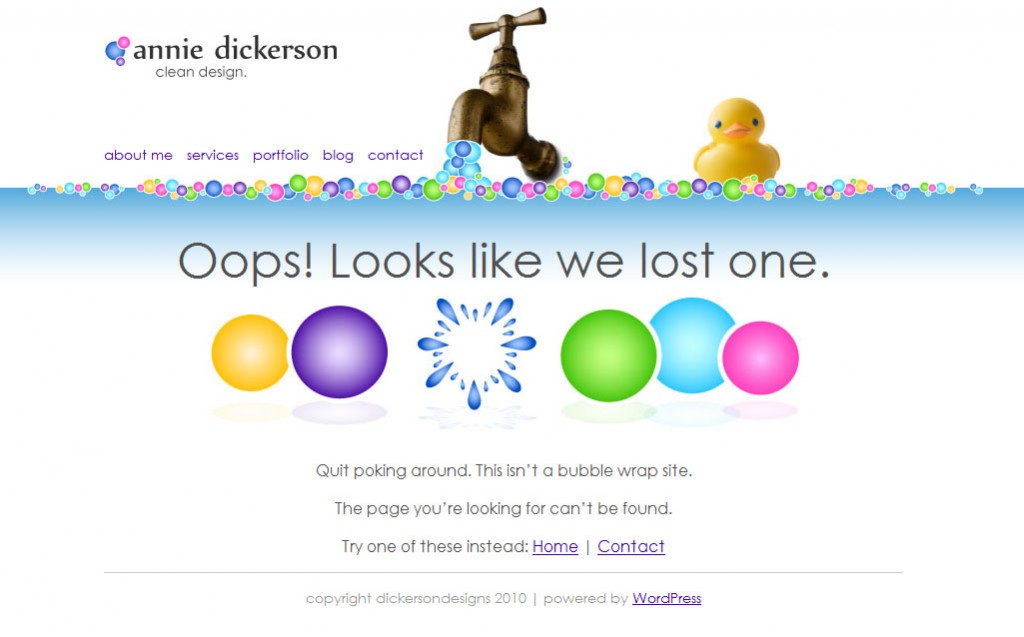
Frustrated because a dead or misspelled link landed you on a 404 page? Everyone’s been there, and no one likes it. Web designers should account for this mishap, creating fun, memorable, and creative 404 messages to appease grumpy users. If you happen to find a dead link on my site, this is what you’ll see: While working on the design for my 404 page, I came across some inspiring and creative 404 messages. Here are a few of my...
by Annie | Dec 29, 2009 | Logoland, Typographically Speaking
When you think of the ABCs, what’s the first thing that comes to mind? Pre-K, the ABC song, Sesame Street? Most likely, art and design don’t immediately pop into your head. And who can blame you? Most people first encounter the ABCs in early childhood, strange symbols printed on paper or posters next to illustrations – the “real” art. The letters are rarely studied for their own artistic value; rather, they are strung together in words and sentences to describe other pieces of art. A recent report published by the University of California, San Diego, suggests that the average American consumes 100,000 words of information in a single day. That’s not hard to imagine considering we can so easily access television shows, video games, emails, and text messages – often simultaneously! Most adults can read a word in less than a second. In fact, many words, such as “the” and “dog” are memorized in early elementary school as sight words, so readers don’t actually read them so much as recognize them. In a world that moves so fast, it’s often difficult to stop and appreciate the simple beauty behind the letters we read and write every day. That’s where letterforms come in. In typography, letterforms refer to the study and design of individual letters. Letterforms help to highlight the aesthetic value of the lines, angles, curves, and shapes that make up letters and are often linked to emotions and hidden meanings, hence their importance in advertising. So the next time you scan an article, pass by a store sign, or read a book with your kids, stop and take...