by Annie | Apr 15, 2010 | Illustration Station
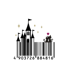
Ever get bored of seeing the same old black-and-white stripes on the products you buy? Sure those random bars and numbers mean something to some warehouse worker somewhere, but let’s face it – barcodes can take up some valuable real estate on product packaging. So, instead of the typical rectangular barcode, why not spice it up a bit? Take a gander at these creative barcodes that will have you looking twice at that product you’re about to put back on the...

by Annie | Mar 23, 2010 | Illustration Station
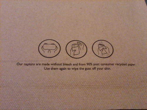
No, this is not a shameless plug for my favorite fast food restaurant, though if it does make you crave Chipotle’s juicy marinated meat, fresh guacamole and salsa, and steamy tortillas, so be it. Conversation can be somewhat difficult for me when eating at Chipotle, since my mouth is constantly stuffed to its maximum capacity. Thus, most of my time is spent looking around, admiring the scenery, and preparing my next perfect bite. During a recent visit to Chipotle, as I was savoring a giant mouthful of goodness, I noticed the graphics on Chipotle’s napkins. What a great means of communication! These graphic instructions provide crucial eating tips while saving paper....

by Annie | Jan 27, 2010 | Adchievements, Illustration Station
Let’s face it. Silhouettes are different. They make you stop and look because silhouettes are not what we see in daily life. When we see silhouettes in ads or logos, our minds are drawn to the simplicity of the image, the beauty of the form, and the outline of the object. Apple’s iPod ads, one of the most popular silhouette ad campaigns, have caused quite a stir. Featuring silhouetted dancers with white earbuds against brightly colored backgrounds, the ads use stark contrast and carry a simple message, garnering attention on a world stage. Since the iPod ad campaign started in 2001, countless variations on the famous silhouette ads have been created. The most successful, however, are those in which the silhouette is instantly recognizable: Think about people or characters you know. Who would make good iPod silhouettes? Who might make less effective...

by Annie | Jan 6, 2010 | Adchievements, Illustration Station, Typographically Speaking
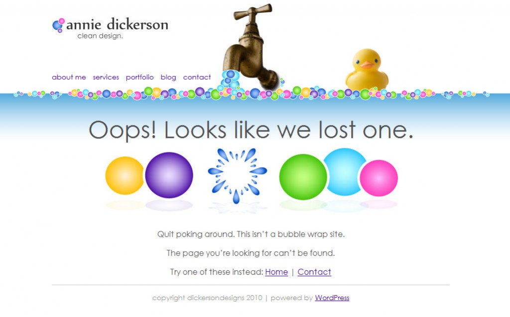
Frustrated because a dead or misspelled link landed you on a 404 page? Everyone’s been there, and no one likes it. Web designers should account for this mishap, creating fun, memorable, and creative 404 messages to appease grumpy users. If you happen to find a dead link on my site, this is what you’ll see: While working on the design for my 404 page, I came across some inspiring and creative 404 messages. Here are a few of my...

by Annie | Jan 5, 2010 | Illustration Station
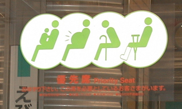
It’s not hard to see that the world is changing. Every time we blink, a new technological device pops up. Transportation is making it easier for people to travel farther and faster, to places inaccessible to our ancestors. This melting pot of cultures and languages brings with it fresh ideas but also fresh challenges. I’ll be the first to admit that I’m no good at languages. I think my brain just didn’t develop that piece needed to retain new vocabulary and verb conjugations for long periods of time. So when I travel to a foreign land, sure I take some time to learn the basics: hello, thank you, bathroom. But more often than not, when I’m standing face-to-face with a native speaker, most of what comes out of my mouth sounds more like, “Uhh…mm…” Apparently my language deficiencies are not too out of the ordinary. Countries are recognizing the need for standardized and pictorial signs, especially for foreign drivers. Here are some of my...

by Annie | Dec 3, 2009 | Illustration Station
I learned to spell the word silhouette in third grade. It probably coincided with some story in reading class and thus popped up in the weekly spelling list. Since then, I’ve always been drawn to silhouette designs. Simple, elegant, and to the point. An effective silhouette highlights unique features without random clutter, helping the viewer appreciate lines and shapes. The stark image communicates the message clearly so that even simple designs can leave a lasting impression. No need for shading, gradients, or textures; just clean design. How to create an effective silhouette design: 1. An easy way to create a silhouette is to use the pen tool in Illustrator or Photoshop to trace an image or photograph. 2. Choose shapes and figures that are unique and interesting. Keep in mind that you don’t have to use the entire person/object. 3. Make sure the silhouette is easily recognizable, unless you’re going for a Rorschach effect. 4. Less is more. Silhouettes stand out because they’re simple. When in doubt, take it...
