by Annie | Feb 24, 2011 | Game Design, Illustration Station
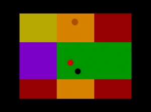
When you’re up late working until 3am and can’t wait to wake up to keep working, you know you’re in the right business. For me, that’s the business of making games. The past couple of weeks have been extremely hectic, to say the least. Juggling the many aspects of preproduction can be quite difficult, especially when there are also several classes crowding your plate. In the past few weeks, I’ve produced countless art assets and taken them through multiple iterations, created diagrams showing the specifics of our gameplay mechanics, and prototyped many of the main mechanics in our game while learning the ins and outs of Unity, all while simultaneously working on a Flash game as well. It makes me tired just thinking about all that work, but I enjoyed every moment of it. And like all hard work in games, I think I deserve an achievement or two, perhaps these: 1. Seeing Ai to Ai With all the vector art I’ve created in the past few weeks, I now know Adobe Illustrator (Ai) better than I ever have. Ai and I, we’re tight. 2. Off on a Tangent Programming brings back all those memories of high school geometry. So first and foremost, a special thanks to Mrs. Jones for making me memorize soh-cah-toa (sine = opposite over hypotenuse, cosine = adjacent over hypotenuse, and tangent = opposite over adjacent). And thank you, Joe, for helping me remember what all that meant. 3. Design on a Dime Everyone loves free stuff. To fill up two buy-six-coffees-get-one-free cards in a single week? Pure heaven. 4. Pitchin’ In I can’t remember...

by Annie | Feb 14, 2011 | Game Design, Illustration Station
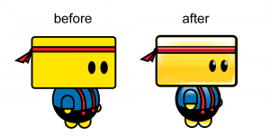
Thanks to everyone for your prompt and constructive feedback on Chip and the art in our game so far. I’m working through the feedback bit by bit, but I thought I’d give you a sneak peek into Chip’s makeover. Many of you pointed out that Chip seemed flat and didn’t blend in with the environment around him, and we totally agree. We’re still working on his proportions and body shape, but here are a couple of updated images. Updated environment images are still in the works. Keep the feedback...

by Annie | Feb 10, 2011 | Game Design, Illustration Station
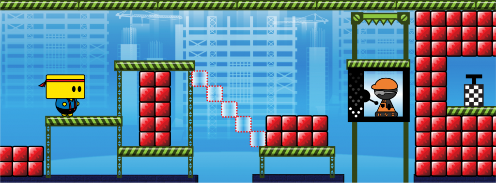
As I’ve been mentioning again and again in my blog lately, we’ve been working very hard on our final game project concepts. And at this point, we’re ready to introduce the world to Chip, the protagonist in our game. In the image above, Chip is the yellow blockheaded guy on the left. The concept and mechanics are still being hammered out, but we need all the feedback we can get. Whether or not you’re an artist or game designer, we want to hear from you. How does Chip look? How does the environment look? What do you think of the colors, shapes, lines, spacing, style, etc.? What stands out? What caught your eye first? We realize the importance of the look and feel of a game in attracting and maintaining players, so we’d love any and all feedback. Please comment below or send me your thoughts....
by Annie | Dec 16, 2010 | Game Design, Illustration Station, Logoland
Making things simple can be complicated. In designing the interface and front end menu screens for my iPhone rhythm platformer concept Double Helix, I tried to communicate as much as possible with as few elements as possible. The front end for Double Helix includes a main menu screen that allows you to navigate to the game itself or to open an options or about menu. (The game screen is just a mockup, but all the interface buttons work.) Take a...

by Annie | Dec 13, 2010 | Game Design, Illustration Station
After my latest level, my hat is off to game artists for the crucial contribution they make to the success of games. A few weeks ago, we were tasked with creating a new UDK level. Unlike previous projects, this assignment came with no restrictions or guidelines. We could use what we’d learned to create any type of level in any genre. Great. Just great. After several days of dead ends and deliberations, I decided on a simple top-down shooter using color as a main feature. As I began constructing the level, I grabbed the default color textures supplied by UDK, effectively turning my level into a disco party. Through the many long days of scripting and testing my level, I got many inquisitive looks from my peers and remarks like, “Are THOSE the textures you’re using for your final level?” and “Please tell me those aren’t the materials you’re using.” With a nervous laugh, I’d shrug, replying “No no no, these are just placeholders.” Though in the back of my mind, I had little idea of what I’d use to replace the neon textures. Thankfully, I was able to spend several days on art and overall polish after finishing most of the scripting and debugging. I created a simple front-end with a custom logo and retextured all the surfaces in my game. Chromattack is a top-down vertical scrolling shooter in which you try to shoot as many enemies as possible while trying to evade them. The game starts out with just a few slow enemies. You can shoot forward and backward, as well as left and right. You can shoot enemies...

by Annie | Sep 20, 2010 | Illustration Station
If you think about it, many of the most memorable game character sprites were created through painting pixels on a screen. Mario and Pacman are not remembered for their fancy 3D shading but rather for their classic iconic looks. Good pixel art involves an intricate knowledge of color and lighting. You must choose the best shades for shadows and highlights, then paint them over the right pixels to make your pixel art come to life. You only have so much space, so you have to make every pixel count. Here’s my latest pixel art character – a hobo monkey whose knapsack doubles as a weapon/water balloon/intimidation...
