by Annie | Mar 15, 2014 | Illustration Station
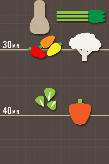
I’m a huge fan of roasting veggies. Broccoli, squash, carrots – you name it, I roast it. However, I’m always nervous about getting the roasting time wrong, since different veggies require different amounts of time in the oven, so as I’m tossing the veggies in olive oil with one hand, I’m often clumsily googling the roasting time with my other hand. The solution? I’ve created a cheat sheet for roasting veggies. I hope this simple chart helps you roast with confidence. Enjoy....
by Annie | Sep 27, 2011 | Education, Illustration Station
My memories of elementary and middle school are littered with instances of kids being scolded for doodling in class. By high school, most had learned to resist doodling in front of the teacher or had just gotten better at hiding it. Even though I’d heard bits and pieces here and there about the benefits of doodling in helping with focus and information processing, as a teacher, I still felt compelled to frown upon doodling in my classroom. After all, every teacher I’d ever had discouraged doodling. Even now, when I see people doodling in class or during meetings, my first thought is, “Geez, why can’t that person just pay attention?” But when I stop to think about my own doodling habits, I find that I tend to doodle when I’m trying to concentrate. I almost always doodle when I’m on the phone, especially during those oh-so-lovely phone interviews. Though many are quick to dismiss doodling as a mindless pastime, research finds that doodling actually aids in processing complex information. So if you’re a closet doodler or have ever looked down on someone for doodling during a meeting, take a...

by Annie | Apr 13, 2011 | Game Design, Illustration Station
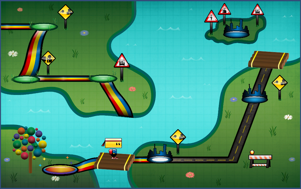
To say I’ve learned a lot about scripting over the past several weeks is an understatement. I’ve gone from struggling to create basic character movement to creating functions that can “think” on their own. But most of all, I’ve learned that programming is not just about working hard, but more importantly, about working smart. One of my recent tasks has been to design and implement a level select map. After plotting the levels on the map, my first instinct was to script the individual events for each level. So, for example, if level 3 was just completed, the spotlight for the next level would need to go on the level 4 marker. If Chip is on the raft between levels 3 and 4, he can go to the right for level 4, get back on the raft and go left for the bonus level, or get on the raft and go up to get back to level 3. But he would not be able to go past level 4. As you can imagine, the list of conditionals and events needed for each spot quickly grew quite lengthy. The solution? Work smart. I stepped back and analyzed the commonalities amongst the different stopping points on the map. Chip would need to stop at level markers, but also rafts and corners as well. But he would only be able to launch into a level while currently standing on a level marker. As the patterns started to emerge, I was able to formulate functions and algorithms so the code would work for me, rather than the other way around. It didn’t come without...

by Annie | Mar 15, 2011 | Game Design, Illustration Station
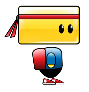
I am by no means a character designer. Throughout my patchy art and design background, I’ve always shied away from designing characters. Landscapes, fanciful illustrations, and fonts – those I can do. Characters? Nuh-uh. To me, designing characters is the hardest type of design. Breathing life into a being created through imagination takes both skill and courage. That’s why when it came time to design the main character for our game, I tried to pass the task off to anyone and everyone. I didn’t want to shoulder the responsibility because I didn’t think I was capable of creating a likable, memorable, and functional character. What followed were weeks of ups and downs. Frustration, excitement, spurts of creativity, anxiety, and lots of iteration. When designing Chip, we prioritized three things: cuteness, functionality, and memorability. First and foremost, he had to have a blocky head which could pivot to deflect balls. To speak to the intuitiveness and simplicity of our mechanics and gameplay, we also designed Chip using basic shapes and primary colors. No character is perfect, but I think we’re finally at a point where we’re all satisfied with Chip’s design. Chip’s colors are warm and approachable, and his form communicates function. And thus, we’re finally ready to unveil the making of...

by Annie | Mar 9, 2011 | Game Design, Illustration Station
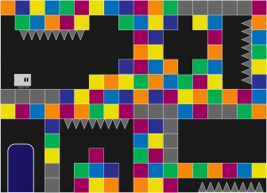
Creating art that effectively communicates gameplay is hard. Not only must functionality and aesthetics work hand in hand, but the visual style must be strong enough to withstand round after round of iteration on game mechanics. Early in preproduction, we knew we had a strong mechanic: a character that throws balls and deflects them with his head to break blocks. However, everyone on the team and everyone we pitched the concept to imagined the game differently. Thus, the art went through several iterations to get to its current state, and certain aspects of the visual style are still undergoing further iteration. One of the earliest art mockups consisted of a small blockheaded character surrounded by blocks and environmental hazards on a single screen. We soon realized that our character needed to communicate more movement, and that perhaps gameplay would extend beyond a single screen. With this mockup, we started to get a sense of the environment around the gameplay. After some experimentation, we created a more whimsical concept, this time with a bolder look and a more memorable character. After further discussions on art and gameplay, we settled on a construction theme, providing more cohesion amongst the elements of the environment. Our current art style aims to communicate both gameplay and function through bold visuals and purposeful design with careful consideration in guiding the player experience. As the mechanics undergo further iteration and tweaking, the art will surely receive further iteration and polish as well. However, by going through multiple rounds of iteration on the visuals and continually going back to the drawing board to push strong visual communication, we’ve...
