by Annie | Oct 14, 2011 | Game Design
All game designers know how to play their own games. The true test is taking those games to the masses for “fresh eyes” testing, a chance to see if your game will sink or float when it’s out in open waters. We just submitted our second iOS game to the App Store today, but before we had the confidence to do so, we made sure to get in as much playtesting as possible. First, we played the heck out the game during our three weeks of development. And as this is a physical activity game, that meant we were often hopping around the office, soliciting some very curious looks. Next, we had friends and family play it. But most importantly, we made sure the game got into the hands of our target audience: kids ages 6-12. Focus groups and playtesting sessions with kids aren’t always as easy and straightforward as they may seem. Kids are different from adults. Some will tell you right off the bat that they hate your game and will identify all the elements they’d like to see improved. Others are much quieter about their opinions, and many are easily swayed by their peers. Thus, in conducting our playtesting sessions, we made sure to emphasize openness, honesty, and respect. We assured our junior playtesters that they were the experts and that we needed their help in designing the best possible game. We playtested individually to eliminate as much bias as possible, and we asked questions both in person as well as through written/artistic responses to give kids as many different avenues of expression as possible. The...

by Annie | Oct 3, 2011 | Game Design
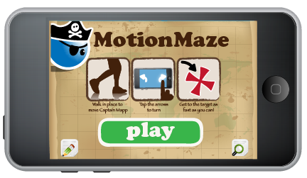
It’s been 5 days since our first game, MotionMaze, made it out onto the App Store. And within those few days, we’ve already learned so much about our audience, our capabilities, and ourselves. Clarity vs. Simplicity It’s important to make your interface and overall game experience as streamlined as possible. However, it’s also important to tread carefully between simple and confusing. To keep our main interface simple, we included icon buttons without text. One button was for feedback, the other for options. Though this was clear to us, users found this frustrating. When they needed options, they couldn’t find the button for it. And when they tapped the feedback button that led them away from the game, it was often out of curiosity. Moving forward, we will be sure to include enough text to ensure that the player experience is clear while the interface remains clean. Wait, how does this work? 3…2…1…Go! The time starts ticking, and you start frantically tapping the screen. When that doesn’t work, you try swiping, then tilting. We knew when we started creating this game that it would be different from typical games in the App Store. However, we failed to include enough measures to help ease our players into this new experience. Even though we included instructions and diagrams on the main screen and in the pause menu, they were easy to skip. Few players realized they needed to stand up to play the game, and even after being told to jog in place, many still needed a demonstration before fully grasping what they needed to do. Moving forward, we realize that with...

by Annie | Sep 28, 2011 | Game Design
Today, our first game, MotionMaze, went live in the App Store. Nothing can quite prepare you for the excitement, pride, and craziness that follows the release of a game. MotionMaze was created within 2 weeks. After spending a significant amount of time designing a larger game with tons of features, we decided that creating a smaller game to prove out the tech and the crazy ideas in our heads might be more useful. And the good thing about working on such a small team is that U-turns and detours can be achieved quite easily. From a game design perspective, working under a strict 2-week deadline is both daunting and helpful. Having to create everything in two weeks forced us to focus on the most crucial features in our game, resulting in a streamlined experience. Sure, there are features I would have added if we had more time, but ultimately, the game is immensely more useful in the hands of players than sitting on our computers here in the office. So check it out for yourself. Head on over to the App Store and download MotionMaze now!...
by Annie | Sep 7, 2011 | Game Design
Many independent developers fall into the trap of taking too long to finish a game. Just…need…to add…this one more thing. What I’ve learned from developing games is that a game is never truly done. You can work on it and polish it forever and never be truly satisfied. I still look at each game I’ve worked on and wish I could have more time to add in more sound effects, some crisper animations, or more character expressions. But ultimately, I’m glad that the games I’ve released are just that – released. They’re out in the world being played. Just as they were intended to be all along. And often, that bug I obsessed over or the sprite I could never get just right are overlooked by players, and instead, they point me in different directions and spark new possibilities. So when is it time to release a game? When someone can play your game from start to finish without needing your help or additional explanations and without the game crashing, it’s time. You can always add in more art, sound effects, and levels in future updates and patches. But until you get the game into players’ hands, it’ll remain a concept, another unrealized vision collecting dust on your “someday” shelf. So go on. Get it out there so we can all play it....

by Annie | Aug 30, 2011 | Game Design
Finalists Named for 2011 Unity Awards Looks like Blokhead is getting a bit of love from the Unity community. We’re keeping our fingers...

by Annie | Aug 24, 2011 | Game Design
I played a game today. No, it wasn’t Monopoly, Minesweeper, or Street Fighter. A few days ago, I got an Amazon gift card from my parents-in-law. So today, I played the Amazon gift card game. Curious? Here’s the high-level pitch: Play as a shopper trying to buy as many different items for a new apartment as possible while staying within the gift card amount. Rules: – Items must currently be in stock. – Shipping cost for each item cannot exceed item cost. – Bonus points for items that can be shipped together. The Result: I started out by filling up my shopping cart with over 3 times the amount of the gift card. Lots of balancing, compromising, and trading later, I ended up purchasing 8 different items for various rooms of my new apartment. In the process, I rediscovered some things I already had, prioritized my shopping list, and got a better idea of what I was looking for. The Takeaway: Anything in life can be a game. Look around you. Take any task, set a specific goal, add a few stipulations and a potential reward, and voila! You’ve got fun waiting for you around every corner. Don’t believe me? Try it out. Here are some daily tasks to get you started: – Waiting for the bus – Washing dishes – Going grocery shopping – Paying bills – Making the bed Anyone can be a game designer. Fill your life with games, and you can play even the most ordinary moments...


