by Annie | Apr 13, 2011 | Game Design, Illustration Station
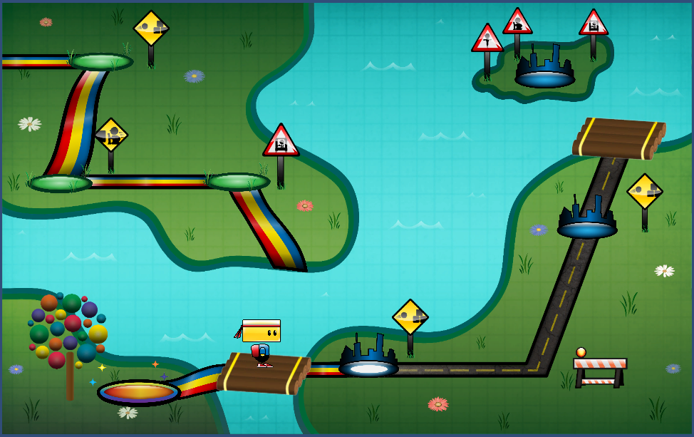
To say I’ve learned a lot about scripting over the past several weeks is an understatement. I’ve gone from struggling to create basic character movement to creating functions that can “think” on their own. But most of all, I’ve learned that programming is not just about working hard, but more importantly, about working smart. One of my recent tasks has been to design and implement a level select map. After plotting the levels on the map, my first instinct was to script the individual events for each level. So, for example, if level 3 was just completed, the spotlight for the next level would need to go on the level 4 marker. If Chip is on the raft between levels 3 and 4, he can go to the right for level 4, get back on the raft and go left for the bonus level, or get on the raft and go up to get back to level 3. But he would not be able to go past level 4. As you can imagine, the list of conditionals and events needed for each spot quickly grew quite lengthy. The solution? Work smart. I stepped back and analyzed the commonalities amongst the different stopping points on the map. Chip would need to stop at level markers, but also rafts and corners as well. But he would only be able to launch into a level while currently standing on a level marker. As the patterns started to emerge, I was able to formulate functions and algorithms so the code would work for me, rather than the other way around. It didn’t come without...

by Annie | Apr 7, 2011 | Game Design, Logoland
Logos have long been one of my favorite parts of graphic design. A logo needs to be simple and straightforward while simultaneously communicating layers of meaning. When designing a logo, I first think long and hard about what I want the image to communicate, filling the pages of my sketchbook with words and doodles. Color choice, typography, style, and spacing all play important roles and can drastically change the look and feel of a logo. In designing the logo for our current game Blokhead, I wanted to create a bright and strong logo that would communicate the main mechanic of throwing and deflecting balls. I wanted the logo to communicate both action and fun. The result is a logo comprised of primary colors and thick blocky letters that incorporate the L and O of Blokhead into an image of a bouncing ball. Simple, functional,...

by Annie | Mar 30, 2011 | Game Design
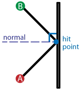
Creating a full game for the first time no doubt brings about surprises. But one surprise I didn’t expect was having to dig up the little high school trigonometry knowledge I’d long ago buried in the deep recesses of my brain. So dust off the cobwebs and come along for the ride. Here’s your daily dose of vector math. Aim Assist Ball In the process of designing ball powerups for our game, we decided to add an aim assist ball that would show players the trajectory of the ball, as well as the first deflection, allowing players to line up their shots more accurately for long shots. The task of programming this nifty little powerup fell to me. Ball Physics To start, I looked at the ball physics of classics like Pong and Arkanoid, analyzing the angles of deflection and trying to figure out the patterns. Soon, it was time to get out the graph paper and start plotting points. In order to show the trajectory, I would need to know the initial angle the ball was aimed. In order to figure out the angle of deflection, I would need to figure out the orientation of the surface the ball would hit, as well as the angle of the collision. After plugging and chugging several sets of numbers and angles, I finally realized the common thread. So for those of you still hoping to create a Pong game of your own, here’s the anatomy of ball deflection. Hit Normal First and foremost, we need to figure out the orientation of the surface the ball hits. Is the surface vertical, horizontal,...

by Annie | Mar 22, 2011 | Game Design
As we’re starting to create levels in Unity, we’re discovering that making 2D levels in a 3D environment is no walk in the park. Luckily, we’ve discovered UniTile, an easy to use yet powerful tile-based 2D map editor for Unity. If you’re interested, you should definitely check out the UniTile demonstration video to glimpse some of its capabilities. UniTile allows us to “paint” levels into Unity, then immediately jump into them to test them out, decreasing our level building time by several hours. If you’ve decided that UniTile is appropriate for your project, here are a few simple steps for setting up and getting started. Installing UniTile UniTile comes as a Unity package, so you can just import the package into any existing project. Once you’ve saved the package on your computer, open your Unity project, then go to Assets > Import Package and browse to find the UniTile package. Creating Textures Before setting up UniTile in a new scene, you’ll need a texture that holds the pieces you want to use in your level. I create my textures in Adobe Illustrator, then export them as PNGs. Importing Textures You can then import the texture into your project. To do this, right-click in the Project window and go to Import New Asset, then find your texture. After importing, I modify the following settings for my textures: Filter Mode: Trilinear Texture Type: Advanced Generate Mip Maps: Disable Creating Materials After importing the texture, create a new material. To do this, right-click in the Project window and go to Create > Material. Drag your texture onto the material and adjust the material settings. For...

by Annie | Mar 15, 2011 | Game Design, Illustration Station
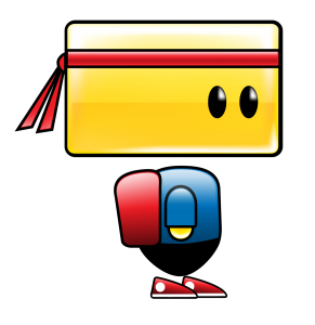
I am by no means a character designer. Throughout my patchy art and design background, I’ve always shied away from designing characters. Landscapes, fanciful illustrations, and fonts – those I can do. Characters? Nuh-uh. To me, designing characters is the hardest type of design. Breathing life into a being created through imagination takes both skill and courage. That’s why when it came time to design the main character for our game, I tried to pass the task off to anyone and everyone. I didn’t want to shoulder the responsibility because I didn’t think I was capable of creating a likable, memorable, and functional character. What followed were weeks of ups and downs. Frustration, excitement, spurts of creativity, anxiety, and lots of iteration. When designing Chip, we prioritized three things: cuteness, functionality, and memorability. First and foremost, he had to have a blocky head which could pivot to deflect balls. To speak to the intuitiveness and simplicity of our mechanics and gameplay, we also designed Chip using basic shapes and primary colors. No character is perfect, but I think we’re finally at a point where we’re all satisfied with Chip’s design. Chip’s colors are warm and approachable, and his form communicates function. And thus, we’re finally ready to unveil the making of...
