by Annie | Oct 27, 2011 | Game Design
We released Pop & Dodge on the App Store about a week ago. No marketing, no launch parties, just put it out there. The result? Pretty much as expected, Pop & Dodge is nowhere to be found on any featured or top 25 lists. In the wake of the release, we’ve been doing a lot of marketing catch up work, submitting the game to different blogs and review sites. A few, including Tech Vibes, have agreed to post reviews. But how much will that help in getting our game out there? According to the lessons learned from other indie app developers, likely not much. It takes high production values, lots of content, and a wickedly good game to sustain the buzz it takes to keep people coming back to your game. And with our 3-week production cycle, we just didn’t quite make it there. However, this is just the beginning. We’ve learned a lot from MotionMaze and Pop & Dodge, about gameplay, tech requirements, and our market. We have a firmer grasp on our goals and limitations and take our lessons with us into our next...

by Annie | Oct 24, 2011 | Game Design
If you liked MotionMaze, you’re going to love MotionMaze: Trick or Treat. This time, you play as Boo the Ghost, picking up candy corn treats as you make your way through graveyard mazes. This Halloween version of MotionMaze includes new graphics, 96 new mazes, achievements, and GameCenter support. Check it out...

by Annie | Oct 20, 2011 | Game Design
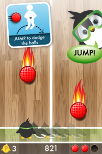
I’m going to take a wild guess that you like penguins. I know, it’s a bit presumptuous of me, but really. How can you not love flightless waddlers perpetually dressed in tuxes? And while I’m at it, I’m also going to assume that you possess some fondness, however minute, for the game of dodgeball. Add them up and what do you get? Pop & Dodge. Pop & Dodge is a physical activity game in which you stand up and jump to move Beeker the Penguin side to side to avoid getting hit by oncoming dodgeballs. Time your jumps just right, and you can also pick up coins and powerups along the way. Have an iPod, iPad or iPhone? Go try it out now, and let us know what you think!...

by Annie | Oct 14, 2011 | Game Design
All game designers know how to play their own games. The true test is taking those games to the masses for “fresh eyes” testing, a chance to see if your game will sink or float when it’s out in open waters. We just submitted our second iOS game to the App Store today, but before we had the confidence to do so, we made sure to get in as much playtesting as possible. First, we played the heck out the game during our three weeks of development. And as this is a physical activity game, that meant we were often hopping around the office, soliciting some very curious looks. Next, we had friends and family play it. But most importantly, we made sure the game got into the hands of our target audience: kids ages 6-12. Focus groups and playtesting sessions with kids aren’t always as easy and straightforward as they may seem. Kids are different from adults. Some will tell you right off the bat that they hate your game and will identify all the elements they’d like to see improved. Others are much quieter about their opinions, and many are easily swayed by their peers. Thus, in conducting our playtesting sessions, we made sure to emphasize openness, honesty, and respect. We assured our junior playtesters that they were the experts and that we needed their help in designing the best possible game. We playtested individually to eliminate as much bias as possible, and we asked questions both in person as well as through written/artistic responses to give kids as many different avenues of expression as possible. The...

by Annie | Oct 3, 2011 | Game Design
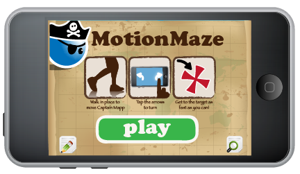
It’s been 5 days since our first game, MotionMaze, made it out onto the App Store. And within those few days, we’ve already learned so much about our audience, our capabilities, and ourselves. Clarity vs. Simplicity It’s important to make your interface and overall game experience as streamlined as possible. However, it’s also important to tread carefully between simple and confusing. To keep our main interface simple, we included icon buttons without text. One button was for feedback, the other for options. Though this was clear to us, users found this frustrating. When they needed options, they couldn’t find the button for it. And when they tapped the feedback button that led them away from the game, it was often out of curiosity. Moving forward, we will be sure to include enough text to ensure that the player experience is clear while the interface remains clean. Wait, how does this work? 3…2…1…Go! The time starts ticking, and you start frantically tapping the screen. When that doesn’t work, you try swiping, then tilting. We knew when we started creating this game that it would be different from typical games in the App Store. However, we failed to include enough measures to help ease our players into this new experience. Even though we included instructions and diagrams on the main screen and in the pause menu, they were easy to skip. Few players realized they needed to stand up to play the game, and even after being told to jog in place, many still needed a demonstration before fully grasping what they needed to do. Moving forward, we realize that with...
