by Annie | Apr 27, 2012 | Game Design
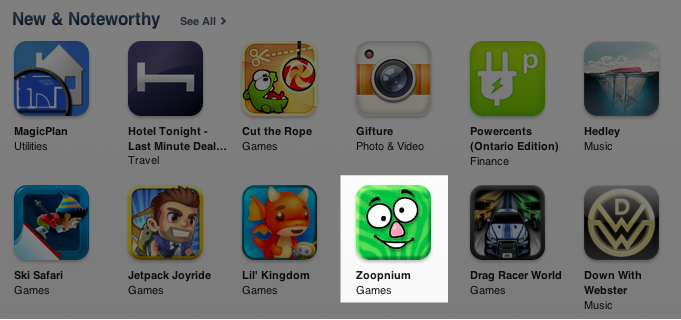
Looking for a new fun way to get active? Try out Zoopnium, the latest app from Digido Interactive, now featured in the New & Noteworthy section in the App Store. Just fire up the Zoopnium app, put your device in your pocket, and get moving. Every step you take helps you collect Zoopnium. Collect enough, and you can create your own custom Zoops and even trade them with friends. Try it out now! UPDATE: Zoopnium is now one of the top ten kids’ games in Canada with thousands of downloads and playthroughs. What are you waiting for? Download it, play it, rate...
by Annie | Apr 16, 2012 | Game Design
When most people think of game design, they think of the big picture. Game designers come up with the overall concept for a game – the characters, storyline, and mechanics. What many fail to realize is that game design is in the details. After the overall concept is nailed down and a prototype has been hammered out, the game designer spends countless hours fine tuning a game, making sure that every action, level, and challenge feels good and increases the amount of fun in the game. When the topic of gameplay tuning comes up, many people say that it comes down to a feeling you get when you play the game. When the feeling is right, the game is well balanced. And I agree, to a certain degree. While a big part of tuning is intangible and abstract, there are definite advantages in tying those abstractions to concrete measures. Here’s how. Set Specific Goals The most important part of tuning is to create a goal. Often, you can change a game so drastically through tuning that it can cater to completely different audiences. Thus, you must first decide on your target market and target experience. Is this a hardcore shooter for 20-year-old guys? A mind-bending puzzle game for tween girls? A social game for middle-aged folks? Setting a specific goal will help guide your tuning. As you tune, put yourself in the shoes of your target audience and see if the game has the targeted effect on you. Should the game put you on the edge of your seat? Allow you to play mindlessly? Continue over multiple days? By...

by Annie | Apr 10, 2012 | Game Design
Yesterday was my first day as a designer at East Side Games (ESG). After wrapping up our latest product, Digido Interactive decided to put development on an indefinite hiatus. Luckily, I was able to find a spot at ESG. Since September of last year, Digido and ESG have occupied a common office space, so I’ve had plenty of opportunities to eavesdrop on ESG meetings and grab coffees with ESG folks. My desk literally moved about 20 feet over. But even given all that, a first day is still a first day. And all first days are long. I remember my first day of teaching like it was yesterday. I was so busy trying to keep up with 20+ kids and simultaneously trying to teach them a thing or two that I lost over a dozen pens. I would put a pen down, then have no recollection of where it could be. By 10am, my voice was hoarse, my feet were sore, and I was planning a career change. When the end of that first day finally came, I spent the rest of the evening prepping for day two. Talk about a trial by fire. Thankfully, my first day at ESG was much less painful. Right away, I was given responsibility, creative freedom, and support. And now, at the end of my second day, I’m happy to report that this transition has gone quite smoothly so far. And I still have all the pens I started...
by Annie | Apr 6, 2012 | Game Design
When user interfaces are well designed, they fade into the background, a seemingly insignificant part of the overall product design. However, when interfaces are poorly designed, they can build walls that turn users away. Psychology is a major component of building intuitive interfaces. When we interact with a new interface, we bring with us cognitive baggage – all our previous cultural knowledge and expectations about how the interface should work. When we see something that looks like a button, we expect to be able to press it to instigate an action. However, if that image turns out to be unclickable, or if the action that follows is unexpected, we’re taken aback. In game design, this can sometimes be a good thing. After all, in order to create innovative products, you have to change users’ preconceived notions and expectations. However, if the experience is so foreign that it becomes frustrating, this can easily turn a user away. One of the best ways to find the hiccups in your interface design is to watch users try it out. They will naturally bring their cognitive baggage to the product, and if they’re able to use your product without having to focus on the interface, you’re well on your way to a solid design. Interested? Here are a couple of additional resources: The Design of Everyday Things Intuition, Expectations and Culture: Learning from Psychology to Build Better Game...
