by Annie | Feb 23, 2012 | Game Design
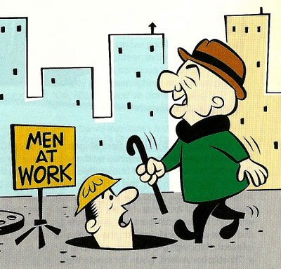
Have you ever seen a game or website and thought, “Wow, that looks amazing. But what do I do?” Amidst the clutter of text or perhaps the overly minimalistic style, you as the user are at a loss for how to interact with the tool. Design is arguably one of the most interesting and creative industries out there. As a game designer, I get to make things up out of my head and then have other people play through my ideas. The downside of this creative freedom is that it’s easy to get sucked into the depths of designer myopia (i.e., nearsightedness), in which you start designing things for yourself rather than for the end user. It’s quite a common phenomenon, and we’ve all been there. I can’t count the number of times I’ve replaced text instructions with what I thought were much cleaner illustrated instructions or the times I’ve made a puzzle easier or harder to suit my personal play style. Failure to explain what I perceived to be obvious parts of my designs have often resulted in confused or frustrated users. As this Smashing Magazine article writes of web designers, “[designers] see typography and rounded corners where normal people just see websites to get stuff done on.” In other words, there’s a fine line between design and function. When designing, we need to take into account the end user’s experience, rather than focusing purely on our own design wishlists. So what do we do about it? Unfortunately, there’s no quick and easy prescription for design myopia. However, the easiest way to alleviate the issue is to continually...

by Annie | Feb 6, 2012 | Education, Game Design
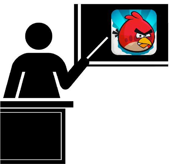
As a teacher, I used a lot of games in the classroom. However, it wasn’t until I left the classroom that I realized the untapped potential of existing games in transforming the educational landscape. Most people are starting to come to terms with the effectiveness of games in teaching. However, educators often overlook popular titles in favor of “educational games.” Though these educational games are certainly a step up from textbooks, they often fail to create a truly captivating experience. Thus, the dilemma. Educators know that games can engage students, but even the best educational games out there can’t compare to Angry Birds and Call of Duty. Oh dear, what to do? The answer is closer than you think. In fact, it’s staring you in the face. Instead of trying to create educational games like Angry Birds, why not just use Angry Birds itself? Every game has the potential to be a powerful educational tool. Don’t believe me? Here are some examples: Fruit Ninja: Line Graphs Have students use line graphs to determine the value of different combos in the game. Angry Birds: Perspective Have students think about the conflict between the birds and the pigs from the pigs’ perspective. Paper Toss: Wind Speed Have students analyze the trajectory of the ball and build an apparatus to measure wind speed. Doodle Jump: Ratios and Scale Have students put themselves in the game by measuring jump height and designing a level to scale. Canabalt: Parallax Effect Have students analyze the parallax effect in the background of the game, the principles of which are used by astronomers to measure far away...
