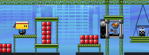
Creating art that effectively communicates gameplay is hard. Not only must functionality and aesthetics work hand in hand, but the visual style must be strong enough to withstand round after round of iteration on game mechanics.
Early in preproduction, we knew we had a strong mechanic: a character that throws balls and deflects them with his head to break blocks. However, everyone on the team and everyone we pitched the concept to imagined the game differently.
Thus, the art went through several iterations to get to its current state, and certain aspects of the visual style are still undergoing further iteration.
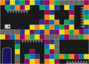
One of the earliest art mockups consisted of a small blockheaded character surrounded by blocks and environmental hazards on a single screen.
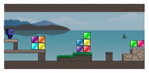
We soon realized that our character needed to communicate more movement, and that perhaps gameplay would extend beyond a single screen.
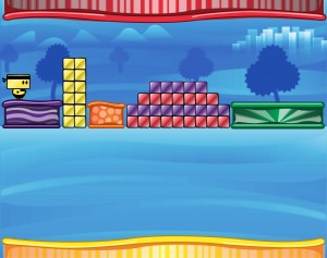
With this mockup, we started to get a sense of the environment around the gameplay. After some experimentation, we created a more whimsical concept, this time with a bolder look and a more memorable character.
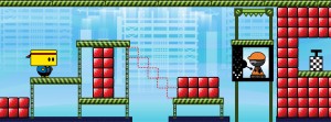
After further discussions on art and gameplay, we settled on a construction theme, providing more cohesion amongst the elements of the environment.
Our current art style aims to communicate both gameplay and function through bold visuals and purposeful design with careful consideration in guiding the player experience.
As the mechanics undergo further iteration and tweaking, the art will surely receive further iteration and polish as well. However, by going through multiple rounds of iteration on the visuals and continually going back to the drawing board to push strong visual communication, we’ve honed our art style to work in tandem with our main mechanics.

