by Annie | Jan 30, 2010 | Other
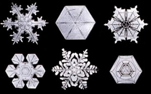
Did you know that each snowflake is made up of roughly 1,000,000,000,000,000,000 water molecules? That’s why it’s practically impossible to have two identical flakes, since all the water molecules grow at different rates. I can’t think of a single thing that I could design with infinite variations. Thumbs up, Nature. Job well...

by Annie | Jan 27, 2010 | Adchievements, Illustration Station
Let’s face it. Silhouettes are different. They make you stop and look because silhouettes are not what we see in daily life. When we see silhouettes in ads or logos, our minds are drawn to the simplicity of the image, the beauty of the form, and the outline of the object. Apple’s iPod ads, one of the most popular silhouette ad campaigns, have caused quite a stir. Featuring silhouetted dancers with white earbuds against brightly colored backgrounds, the ads use stark contrast and carry a simple message, garnering attention on a world stage. Since the iPod ad campaign started in 2001, countless variations on the famous silhouette ads have been created. The most successful, however, are those in which the silhouette is instantly recognizable: Think about people or characters you know. Who would make good iPod silhouettes? Who might make less effective...

by Annie | Jan 24, 2010 | Logoland
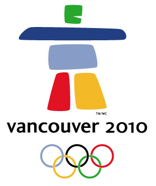
I’ve never been a big fan of Valentine’s Day, so I was extremely excited when I realized that this February would be filled not with pink doily hearts, but rather with ski jumps, figure skating, and curling. Miniature cupids, make way for the Winter Olympics, beginning with the opening ceremony on February 12th in Vancouver. This year, couples can bond over nail-biting triple lutzes and 70mph ski maneuvers. No cheesy, sentimental cards needed. The Vancouver 2010 emblem was chosen from among 1,600 entries. It represents Ilaanaq, the Inuit word for friend, and features five stone-like formations in vibrant colors from the Olympic logo, nature, and Canadian pride. Here’s a look back at Winter Olympic emblems from the last 30...

by Annie | Jan 20, 2010 | Adchievements
I very clearly remember teaching myself how to blow bubbles. Many hopeful tries, many failed attempts. My mouth seemed too small, the bubble gum too slippery, and my teeth-tongue coordination just not quite mature enough. Evidently, perseverance is a wannabe bubble blower’s best friend. After many attempts, I finally got the hang of it without drooling or spitting my gum out along with the would-be bubble. Bubble Yum, Bazooka, Juicy Fruit, Bubble Tape – any and all types and flavors of bubble gum were good for an afternoon of bubble blowing fun. Bubble gum on your face, on your clothes, in your hair, and in your friend’s hair were all signs of fun times. Here are some fun bubble gum ads if you’re in the mood to reminisce on childhood bubble gum...

by Annie | Jan 12, 2010 | Logoland, Typographically Speaking
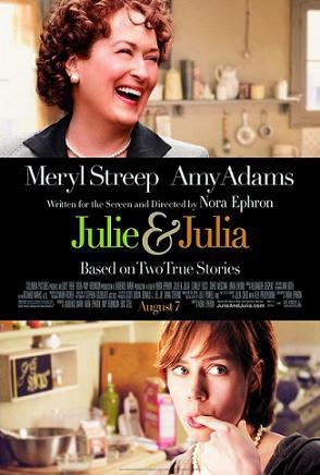
I recently watched the book-turned-movie Julie and Julia, a very fun movie based on an inspirational story that brings together modern day young professional Julie Powell with famous TV chef Julia Child. The title screen of the movie incorporates a scripty ampersand, representing the unity of time periods, locations, and styles. So I got to thinking, where did the ampersand come from? According to Wikipedia, the word ampersand comes from the phrase “and per se and,” meaning “and [the symbol which] by itself [is] and.” I recall hearing in high school Latin class that the ampersand comes from the Latin word “et,” meaning “and.” In fact, you can trace the evolution of the symbol back to Old Roman cursive, in which the letters E and T were sometimes written together. These days, you can find the symbol practically anywhere: 1. In logos 2. In clothing and accessories 3. Around the house What was once a quick shorthand symbol has now become an icon of class, unity, & enterprise. Bravo, ampersand....
