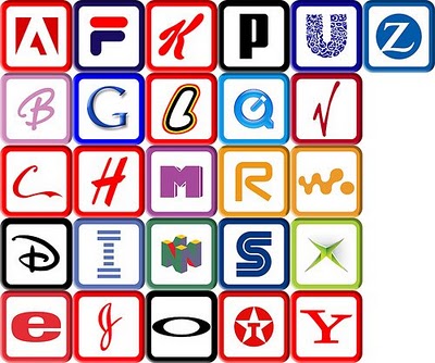
When you think of the ABCs, what’s the first thing that comes to mind? Pre-K, the ABC song, Sesame Street? Most likely, art and design don’t immediately pop into your head. And who can blame you? Most people first encounter the ABCs in early childhood, strange symbols printed on paper or posters next to illustrations – the “real” art. The letters are rarely studied for their own artistic value; rather, they are strung together in words and sentences to describe other pieces of art.

A recent report published by the University of California, San Diego, suggests that the average American consumes 100,000 words of information in a single day. That’s not hard to imagine considering we can so easily access television shows, video games, emails, and text messages – often simultaneously!
Most adults can read a word in less than a second. In fact, many words, such as “the” and “dog” are memorized in early elementary school as sight words, so readers don’t actually read them so much as recognize them. In a world that moves so fast, it’s often difficult to stop and appreciate the simple beauty behind the letters we read and write every day.
That’s where letterforms come in. In typography, letterforms refer to the study and design of individual letters. Letterforms help to highlight the aesthetic value of the lines, angles, curves, and shapes that make up letters and are often linked to emotions and hidden meanings, hence their importance in advertising.
So the next time you scan an article, pass by a store sign, or read a book with your kids, stop and take some time to appreciate the beauty behind the letters we’ve all come to know and love.

