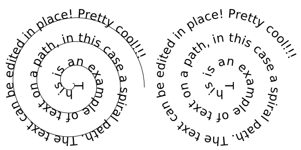
If a picture is worth 1,000 words, using text as image must be worth 1,001. I first learned about the technique of using text as image in college during a book arts class. Prior to that, I hadn’t given typography a second thought, blindly using double-spaced 12-pt. Times New Roman for every paper I’d written. Teachers get cranky otherwise.
The subject of the memoir I wrote for my book arts class was my journey through childhood and adolescence as a fat kid. My professor pushed me at every step to consider all design decisions carefully in order to communicate the message of my story as clearly and effectively as possible. While reading through A History of Graphic Design during one long caffeine driven night, I was blown away by the thought that text could be used as image.
Since kindergarten, I’d been taught the names and sounds of the letters, how to combine the letters to form words, and how to link words to form sentences. During all that, not once did I stop to consider the shapes of the letters themselves. After all, the alphabet is essentially a gallery of 26 pictures that were eventually assigned to sounds.
With that new revelation in mind, I decided to use text as image as the underlying design theme of my book. As I played around with typography, text placement, spacing, and letterforms, I rediscovered the beauty of letters and text, approaching them with the same wonderment and curiosity that I had as a preschooler. Through my study of typography, I learned that effective synthesis of text as image and the underlying message can be a powerful and memorable communicator. Here are a few techniques I discovered along the way:
Text can be used to create simple shapes. Those shapes in turn can form another image.

Text can be used to create more complex shapes or objects, such as this sphere.

Text can be placed on a path, outlining the shapes of hills, rain, or faces.


