by Annie | Dec 31, 2009 | Other
The end of the year can be a hectic time, especially with family get-togethers, travel plans, and holiday gift bills. Thus, it’s easy to overlook New Year’s resolutions or to hastily make a tentative list in your head. Most people have a neverending list of things they’d like to change about themselves and their lives, so making a definitive list of resolutions can be daunting. However, I suggest that you make just one. One resolution that you’re resolved to achieve. If you make just one change in your life, it can have lasting ripples in other areas. Can’t think of any? Here are some ideas to get you started: 1. Start each day purposefully doing what’s most important to you. Perhaps you love to draw but never find the time. Make a commitment to wake up 20 minutes earlier and sketch something every day. 2. Work on something outside of your comfort zone. Take on a project you might normally pass up, or try a different style you don’t normally use. Test your limits. Surprise yourself. 3. Take one purposeful break per day. Schedule one short outing per day that gets you out of your work chair. Try a new coffee shop, sit outside and people-watch, or just walk around the block looking for things you hadn’t noticed before. 4. Clean. An organized workspace can save you tons of time and can be a source of inspiration. 5. Just do it. So many people wait for the ideal time to do or buy something, and often they wait too long. If you’ve been saving a bottle of wine, waiting...

by Annie | Dec 29, 2009 | Logoland, Typographically Speaking
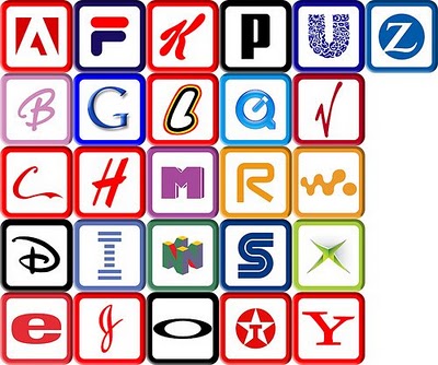
When you think of the ABCs, what’s the first thing that comes to mind? Pre-K, the ABC song, Sesame Street? Most likely, art and design don’t immediately pop into your head. And who can blame you? Most people first encounter the ABCs in early childhood, strange symbols printed on paper or posters next to illustrations – the “real” art. The letters are rarely studied for their own artistic value; rather, they are strung together in words and sentences to describe other pieces of art. A recent report published by the University of California, San Diego, suggests that the average American consumes 100,000 words of information in a single day. That’s not hard to imagine considering we can so easily access television shows, video games, emails, and text messages – often simultaneously! Most adults can read a word in less than a second. In fact, many words, such as “the” and “dog” are memorized in early elementary school as sight words, so readers don’t actually read them so much as recognize them. In a world that moves so fast, it’s often difficult to stop and appreciate the simple beauty behind the letters we read and write every day. That’s where letterforms come in. In typography, letterforms refer to the study and design of individual letters. Letterforms help to highlight the aesthetic value of the lines, angles, curves, and shapes that make up letters and are often linked to emotions and hidden meanings, hence their importance in advertising. So the next time you scan an article, pass by a store sign, or read a book with your kids, stop and take...

by Annie | Dec 24, 2009 | Adchievements, Typographically Speaking
When I decided to venture into the field of digital design, my mom’s main worry was that my college degree in psychology was completely unrelated to design. But in fact, the two fields are inextricably intertwined. Color and typography both have emotional underpinnings, and the subliminal messages behind logos and ads often play mind tricks on uninformed consumers. Take menu design, for example. Did you know that restaurants (along with the menu engineers and menu consultants they hire) spend hours and hours painstakingly obsessing over every element on their menus? Pictures, no pictures, size of text, fonts, colors, adjectives, price display, and spacing are just the tip of the iceberg when it comes to designing an effective menu. Researchers have found that the following can subconsciously massage consumer wallets: 1. Remove dollar signs and cents from prices. Dollar signs remind people of money they don’t want to spend. Cents remind people of pennies they don’t want to deal with. 2. Choose the right colors. Apparently, red and blue stimulate your appetite, while gray and purple make you feel full. 3. Use descriptive menu labels. Packing in adjectives, geographic markers, and even relative names (e.g., Aunt Sally’s Famous Potato Salad) will make dishes sound more appealing. 4. Remove pictures. Imagination always trumps even the best picture a camera can take. 5. Employ the art of contrast. Place an expensive item at the top of the menu, and suddenly everything else seems more affordable. So you decide: which restaurant would you spend more money at? Restaurant A: Restaurant B: For more information on the psychology behind menu design, check out...

by Annie | Dec 23, 2009 | Logoland
When it comes to logos, are you a believer in evolution or, perhaps, intelligent design? Just as people change and technology develops, corporations evolve over time. Companies often adapt their logos to stay in touch with their clients, but too much change can alienate their audience and change their brand identities. Though logos start out as just sketches on paper, they eventually embody the values and vision of the organizations they represent, so even minor tweaks here and there can cause lasting ripples. Let’s take a step back in time and take a look at the evolution of some logos we all know and love. 1. Apple 2. Firefox 3. Starbucks 4. Volkswagen 5. Canon 6. IBM 7. Wal-Mart 8. Morton Salt 9. UPS 10....

by Annie | Dec 21, 2009 | Typographically Speaking
Most articles, reports, and papers we read these days are written in 12-pt. Times New Roman. The few creative ones might venture into Arial or, God forbid, Comic Sans. In the old days, type designers cast fonts in lead, or, more recently, in wood. Back then, typography was a specialized occupation. However, the Digital Age has made type design available for anyone with computer access. If you’re ready to take a crack at type design, head over to FontStruct, which features a free font-building tool. Arrange geometrical shapes in a grid to create your own font. Then download your new font and use in any Mac or Windows application. Give it a...


