by Annie | Mar 15, 2011 | Game Design, Illustration Station
I am by no means a character designer. Throughout my patchy art and design background, I’ve always shied away from designing characters. Landscapes, fanciful illustrations, and fonts – those I can do. Characters? Nuh-uh. To me, designing characters is the hardest type of design. Breathing life into a being created through imagination takes both skill and courage. That’s why when it came time to design the main character for our game, I tried to pass the task off to anyone and everyone. I didn’t want to shoulder the responsibility because I didn’t think I was capable of creating a likable, memorable, and functional character. What followed were weeks of ups and downs. Frustration, excitement, spurts of creativity, anxiety, and lots of iteration. When designing Chip, we prioritized three things: cuteness, functionality, and memorability. First and foremost, he had to have a blocky head which could pivot to deflect balls. To speak to the intuitiveness and simplicity of our mechanics and gameplay, we also designed Chip using basic shapes and primary colors. No character is perfect, but I think we’re finally at a point where we’re all satisfied with Chip’s design. Chip’s colors are warm and approachable, and his form communicates function. And thus, we’re finally ready to unveil the making of...
by Annie | Mar 9, 2011 | Game Design, Illustration Station
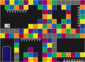
Creating art that effectively communicates gameplay is hard. Not only must functionality and aesthetics work hand in hand, but the visual style must be strong enough to withstand round after round of iteration on game mechanics. Early in preproduction, we knew we had a strong mechanic: a character that throws balls and deflects them with his head to break blocks. However, everyone on the team and everyone we pitched the concept to imagined the game differently. Thus, the art went through several iterations to get to its current state, and certain aspects of the visual style are still undergoing further iteration. One of the earliest art mockups consisted of a small blockheaded character surrounded by blocks and environmental hazards on a single screen. We soon realized that our character needed to communicate more movement, and that perhaps gameplay would extend beyond a single screen. With this mockup, we started to get a sense of the environment around the gameplay. After some experimentation, we created a more whimsical concept, this time with a bolder look and a more memorable character. After further discussions on art and gameplay, we settled on a construction theme, providing more cohesion amongst the elements of the environment. Our current art style aims to communicate both gameplay and function through bold visuals and purposeful design with careful consideration in guiding the player experience. As the mechanics undergo further iteration and tweaking, the art will surely receive further iteration and polish as well. However, by going through multiple rounds of iteration on the visuals and continually going back to the drawing board to push strong visual communication, we’ve...

by Annie | Feb 24, 2011 | Game Design, Illustration Station
When you’re up late working until 3am and can’t wait to wake up to keep working, you know you’re in the right business. For me, that’s the business of making games. The past couple of weeks have been extremely hectic, to say the least. Juggling the many aspects of preproduction can be quite difficult, especially when there are also several classes crowding your plate. In the past few weeks, I’ve produced countless art assets and taken them through multiple iterations, created diagrams showing the specifics of our gameplay mechanics, and prototyped many of the main mechanics in our game while learning the ins and outs of Unity, all while simultaneously working on a Flash game as well. It makes me tired just thinking about all that work, but I enjoyed every moment of it. And like all hard work in games, I think I deserve an achievement or two, perhaps these: 1. Seeing Ai to Ai With all the vector art I’ve created in the past few weeks, I now know Adobe Illustrator (Ai) better than I ever have. Ai and I, we’re tight. 2. Off on a Tangent Programming brings back all those memories of high school geometry. So first and foremost, a special thanks to Mrs. Jones for making me memorize soh-cah-toa (sine = opposite over hypotenuse, cosine = adjacent over hypotenuse, and tangent = opposite over adjacent). And thank you, Joe, for helping me remember what all that meant. 3. Design on a Dime Everyone loves free stuff. To fill up two buy-six-coffees-get-one-free cards in a single week? Pure heaven. 4. Pitchin’ In I can’t remember...
by Annie | Feb 14, 2011 | Game Design, Illustration Station
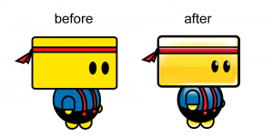
Thanks to everyone for your prompt and constructive feedback on Chip and the art in our game so far. I’m working through the feedback bit by bit, but I thought I’d give you a sneak peek into Chip’s makeover. Many of you pointed out that Chip seemed flat and didn’t blend in with the environment around him, and we totally agree. We’re still working on his proportions and body shape, but here are a couple of updated images. Updated environment images are still in the works. Keep the feedback...
by Annie | Feb 10, 2011 | Game Design, Illustration Station
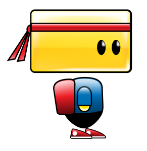
As I’ve been mentioning again and again in my blog lately, we’ve been working very hard on our final game project concepts. And at this point, we’re ready to introduce the world to Chip, the protagonist in our game. In the image above, Chip is the yellow blockheaded guy on the left. The concept and mechanics are still being hammered out, but we need all the feedback we can get. Whether or not you’re an artist or game designer, we want to hear from you. How does Chip look? How does the environment look? What do you think of the colors, shapes, lines, spacing, style, etc.? What stands out? What caught your eye first? We realize the importance of the look and feel of a game in attracting and maintaining players, so we’d love any and all feedback. Please comment below or send me your thoughts....