by Annie | Apr 15, 2010 | Illustration Station
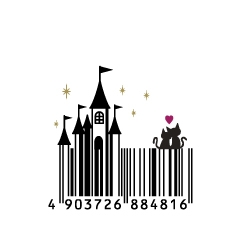
Ever get bored of seeing the same old black-and-white stripes on the products you buy? Sure those random bars and numbers mean something to some warehouse worker somewhere, but let’s face it – barcodes can take up some valuable real estate on product packaging. So, instead of the typical rectangular barcode, why not spice it up a bit? Take a gander at these creative barcodes that will have you looking twice at that product you’re about to put back on the...
by Annie | Mar 25, 2010 | Other
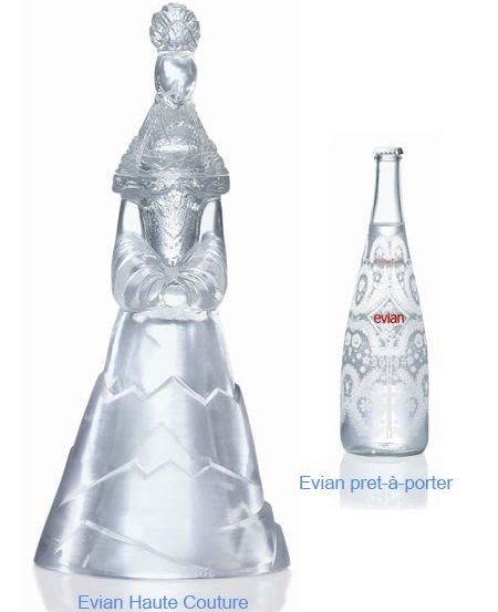
Well, actually, the water bottles below are built to hold cold water (not haute), but you get the idea. I recently attended a meeting at a design firm and was given a bottle of water shaped like a flask. What a novel idea! I could drink the water, fill it back up with <ahem> other clear liquid, and reuse the “water” bottle. Here are some other fun water bottle designs you might run across: In case you’re wondering, the multi-colored bone-shaped bottles were designed for vitamin waters for kids. The bottles double as toys that connect to each other like K’Nex or Legos. Neat,...
by Annie | Jan 30, 2010 | Other
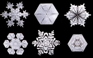
Did you know that each snowflake is made up of roughly 1,000,000,000,000,000,000 water molecules? That’s why it’s practically impossible to have two identical flakes, since all the water molecules grow at different rates. I can’t think of a single thing that I could design with infinite variations. Thumbs up, Nature. Job well...

by Annie | Dec 24, 2009 | Adchievements, Typographically Speaking
When I decided to venture into the field of digital design, my mom’s main worry was that my college degree in psychology was completely unrelated to design. But in fact, the two fields are inextricably intertwined. Color and typography both have emotional underpinnings, and the subliminal messages behind logos and ads often play mind tricks on uninformed consumers. Take menu design, for example. Did you know that restaurants (along with the menu engineers and menu consultants they hire) spend hours and hours painstakingly obsessing over every element on their menus? Pictures, no pictures, size of text, fonts, colors, adjectives, price display, and spacing are just the tip of the iceberg when it comes to designing an effective menu. Researchers have found that the following can subconsciously massage consumer wallets: 1. Remove dollar signs and cents from prices. Dollar signs remind people of money they don’t want to spend. Cents remind people of pennies they don’t want to deal with. 2. Choose the right colors. Apparently, red and blue stimulate your appetite, while gray and purple make you feel full. 3. Use descriptive menu labels. Packing in adjectives, geographic markers, and even relative names (e.g., Aunt Sally’s Famous Potato Salad) will make dishes sound more appealing. 4. Remove pictures. Imagination always trumps even the best picture a camera can take. 5. Employ the art of contrast. Place an expensive item at the top of the menu, and suddenly everything else seems more affordable. So you decide: which restaurant would you spend more money at? Restaurant A: Restaurant B: For more information on the psychology behind menu design, check out...

by Annie | Dec 23, 2009 | Logoland
When it comes to logos, are you a believer in evolution or, perhaps, intelligent design? Just as people change and technology develops, corporations evolve over time. Companies often adapt their logos to stay in touch with their clients, but too much change can alienate their audience and change their brand identities. Though logos start out as just sketches on paper, they eventually embody the values and vision of the organizations they represent, so even minor tweaks here and there can cause lasting ripples. Let’s take a step back in time and take a look at the evolution of some logos we all know and love. 1. Apple 2. Firefox 3. Starbucks 4. Volkswagen 5. Canon 6. IBM 7. Wal-Mart 8. Morton Salt 9. UPS 10....