When I decided to venture into the field of digital design, my mom’s main worry was that my college degree in psychology was completely unrelated to design. But in fact, the two fields are inextricably intertwined. Color and typography both have emotional underpinnings, and the subliminal messages behind logos and ads often play mind tricks on uninformed consumers.
Take menu design, for example. Did you know that restaurants (along with the menu engineers and menu consultants they hire) spend hours and hours painstakingly obsessing over every element on their menus? Pictures, no pictures, size of text, fonts, colors, adjectives, price display, and spacing are just the tip of the iceberg when it comes to designing an effective menu. Researchers have found that the following can subconsciously massage consumer wallets:
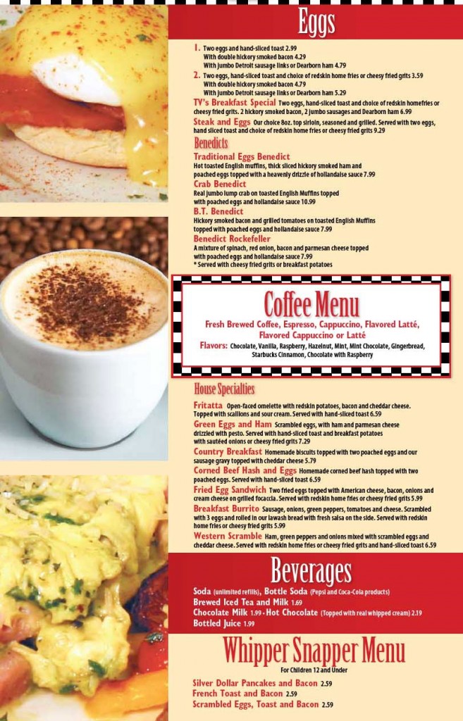
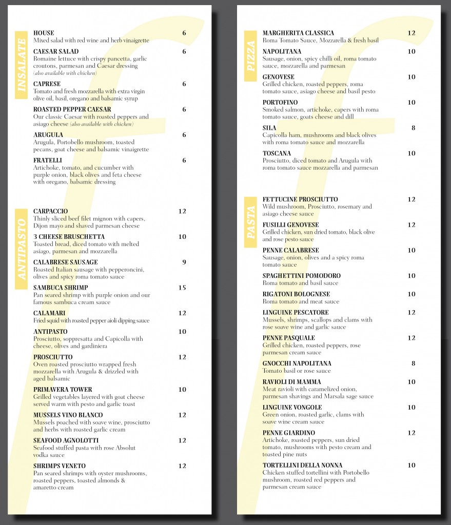
1. Remove dollar signs and cents from prices.
Dollar signs remind people of money they don’t want to spend. Cents remind people of pennies they don’t want to deal with.
2. Choose the right colors.
Apparently, red and blue stimulate your appetite, while gray and purple make you feel full.
3. Use descriptive menu labels.
Packing in adjectives, geographic markers, and even relative names (e.g., Aunt Sally’s Famous Potato Salad) will make dishes sound more appealing.
4. Remove pictures.
Imagination always trumps even the best picture a camera can take.
5. Employ the art of contrast.
Place an expensive item at the top of the menu, and suddenly everything else seems more affordable.
So you decide: which restaurant would you spend more money at?
Restaurant A:

Restaurant B:

For more information on the psychology behind menu design, check out this recent NYTimes article.

