by Annie | Feb 18, 2010 | Typographically Speaking
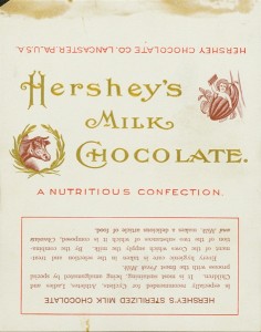
Who doesn’t love a Hershey’s bar? The creamy milk chocolate is a must-have for any s’mores sandwich and makes a delightful anytime snack. Hershey’s bars were originally wrapped in white paper with scripty gold lettering. Through the years, dark paper was introduced due to an accusation of copyright infringement, and the iconic block lettering was added. Hershey bars were just 5 cents through the end of 1969. Then, they doubled to 10 cents, and the price has been climbing ever since. Notice on the earlier versions that the chocolate bar was dubbed a “nutritious confection” and a “nourishing food.” Those labels were dropped in the 1930s, and after the nutrition label was added in 1973, no one can claim that the bar is very nutritious. It is, however, undeniably...
by Annie | Jan 12, 2010 | Logoland, Typographically Speaking
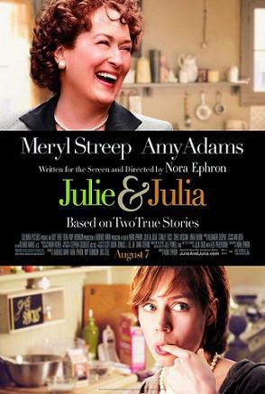
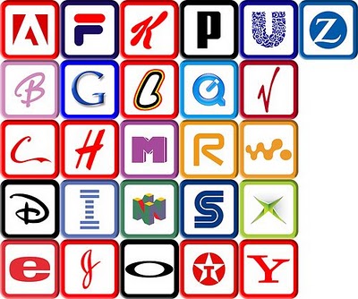
I recently watched the book-turned-movie Julie and Julia, a very fun movie based on an inspirational story that brings together modern day young professional Julie Powell with famous TV chef Julia Child. The title screen of the movie incorporates a scripty ampersand, representing the unity of time periods, locations, and styles. So I got to thinking, where did the ampersand come from? According to Wikipedia, the word ampersand comes from the phrase “and per se and,” meaning “and [the symbol which] by itself [is] and.” I recall hearing in high school Latin class that the ampersand comes from the Latin word “et,” meaning “and.” In fact, you can trace the evolution of the symbol back to Old Roman cursive, in which the letters E and T were sometimes written together. These days, you can find the symbol practically anywhere: 1. In logos 2. In clothing and accessories 3. Around the house What was once a quick shorthand symbol has now become an icon of class, unity, & enterprise. Bravo, ampersand....
by Annie | Dec 29, 2009 | Logoland, Typographically Speaking
When you think of the ABCs, what’s the first thing that comes to mind? Pre-K, the ABC song, Sesame Street? Most likely, art and design don’t immediately pop into your head. And who can blame you? Most people first encounter the ABCs in early childhood, strange symbols printed on paper or posters next to illustrations – the “real” art. The letters are rarely studied for their own artistic value; rather, they are strung together in words and sentences to describe other pieces of art. A recent report published by the University of California, San Diego, suggests that the average American consumes 100,000 words of information in a single day. That’s not hard to imagine considering we can so easily access television shows, video games, emails, and text messages – often simultaneously! Most adults can read a word in less than a second. In fact, many words, such as “the” and “dog” are memorized in early elementary school as sight words, so readers don’t actually read them so much as recognize them. In a world that moves so fast, it’s often difficult to stop and appreciate the simple beauty behind the letters we read and write every day. That’s where letterforms come in. In typography, letterforms refer to the study and design of individual letters. Letterforms help to highlight the aesthetic value of the lines, angles, curves, and shapes that make up letters and are often linked to emotions and hidden meanings, hence their importance in advertising. So the next time you scan an article, pass by a store sign, or read a book with your kids, stop and take...

by Annie | Dec 21, 2009 | Typographically Speaking
Most articles, reports, and papers we read these days are written in 12-pt. Times New Roman. The few creative ones might venture into Arial or, God forbid, Comic Sans. In the old days, type designers cast fonts in lead, or, more recently, in wood. Back then, typography was a specialized occupation. However, the Digital Age has made type design available for anyone with computer access. If you’re ready to take a crack at type design, head over to FontStruct, which features a free font-building tool. Arrange geometrical shapes in a grid to create your own font. Then download your new font and use in any Mac or Windows application. Give it a...

by Annie | Dec 14, 2009 | Adchievements, Typographically Speaking
It’s amazing how the simple ideas stick with us the longest. Many designers use text in interesting ways in their designs. Some use big bold text, others use scripty and flowy text. Even the fourth graders I taught could change fonts, sizes, and colors. However, the designs that we remember most are those in which the text blends seamlessly into the image. Image relies on text, and text relies on...