by Annie | Feb 18, 2010 | Typographically Speaking
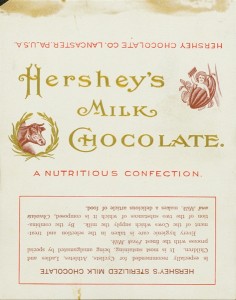
Who doesn’t love a Hershey’s bar? The creamy milk chocolate is a must-have for any s’mores sandwich and makes a delightful anytime snack. Hershey’s bars were originally wrapped in white paper with scripty gold lettering. Through the years, dark paper was introduced due to an accusation of copyright infringement, and the iconic block lettering was added. Hershey bars were just 5 cents through the end of 1969. Then, they doubled to 10 cents, and the price has been climbing ever since. Notice on the earlier versions that the chocolate bar was dubbed a “nutritious confection” and a “nourishing food.” Those labels were dropped in the 1930s, and after the nutrition label was added in 1973, no one can claim that the bar is very nutritious. It is, however, undeniably...

by Annie | Dec 24, 2009 | Adchievements, Typographically Speaking
When I decided to venture into the field of digital design, my mom’s main worry was that my college degree in psychology was completely unrelated to design. But in fact, the two fields are inextricably intertwined. Color and typography both have emotional underpinnings, and the subliminal messages behind logos and ads often play mind tricks on uninformed consumers. Take menu design, for example. Did you know that restaurants (along with the menu engineers and menu consultants they hire) spend hours and hours painstakingly obsessing over every element on their menus? Pictures, no pictures, size of text, fonts, colors, adjectives, price display, and spacing are just the tip of the iceberg when it comes to designing an effective menu. Researchers have found that the following can subconsciously massage consumer wallets: 1. Remove dollar signs and cents from prices. Dollar signs remind people of money they don’t want to spend. Cents remind people of pennies they don’t want to deal with. 2. Choose the right colors. Apparently, red and blue stimulate your appetite, while gray and purple make you feel full. 3. Use descriptive menu labels. Packing in adjectives, geographic markers, and even relative names (e.g., Aunt Sally’s Famous Potato Salad) will make dishes sound more appealing. 4. Remove pictures. Imagination always trumps even the best picture a camera can take. 5. Employ the art of contrast. Place an expensive item at the top of the menu, and suddenly everything else seems more affordable. So you decide: which restaurant would you spend more money at? Restaurant A: Restaurant B: For more information on the psychology behind menu design, check out...

by Annie | Dec 18, 2009 | Adchievements
The period between Thanksgiving and Christmas is one of the most heavily ad-littered times of the year. Between Black Friday and last-minute Christmas shopping, these few weeks often fill store fronts, circulars, and online banners with holiday ads as retailers hope for looser consumer wallets. Here are some ads that have taken a creative and fresh outlook on age-old holiday...

by Annie | Dec 14, 2009 | Adchievements, Typographically Speaking
It’s amazing how the simple ideas stick with us the longest. Many designers use text in interesting ways in their designs. Some use big bold text, others use scripty and flowy text. Even the fourth graders I taught could change fonts, sizes, and colors. However, the designs that we remember most are those in which the text blends seamlessly into the image. Image relies on text, and text relies on...
by Annie | Dec 3, 2009 | Illustration Station
I learned to spell the word silhouette in third grade. It probably coincided with some story in reading class and thus popped up in the weekly spelling list. Since then, I’ve always been drawn to silhouette designs. Simple, elegant, and to the point. An effective silhouette highlights unique features without random clutter, helping the viewer appreciate lines and shapes. The stark image communicates the message clearly so that even simple designs can leave a lasting impression. No need for shading, gradients, or textures; just clean design. How to create an effective silhouette design: 1. An easy way to create a silhouette is to use the pen tool in Illustrator or Photoshop to trace an image or photograph. 2. Choose shapes and figures that are unique and interesting. Keep in mind that you don’t have to use the entire person/object. 3. Make sure the silhouette is easily recognizable, unless you’re going for a Rorschach effect. 4. Less is more. Silhouettes stand out because they’re simple. When in doubt, take it...