by Annie | Jan 11, 2012 | Logoland
I’ve always been entranced by logos. There’s something about the simple complexity of communicating a big message with a small image that’s always fascinated me. Good logos communicate layers of meaning, both boldly and subtly. Take a look at these 50 startup logos from...
by Annie | Dec 13, 2010 | Game Design, Illustration Station
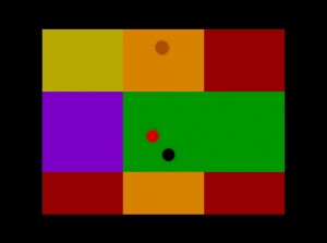
After my latest level, my hat is off to game artists for the crucial contribution they make to the success of games. A few weeks ago, we were tasked with creating a new UDK level. Unlike previous projects, this assignment came with no restrictions or guidelines. We could use what we’d learned to create any type of level in any genre. Great. Just great. After several days of dead ends and deliberations, I decided on a simple top-down shooter using color as a main feature. As I began constructing the level, I grabbed the default color textures supplied by UDK, effectively turning my level into a disco party. Through the many long days of scripting and testing my level, I got many inquisitive looks from my peers and remarks like, “Are THOSE the textures you’re using for your final level?” and “Please tell me those aren’t the materials you’re using.” With a nervous laugh, I’d shrug, replying “No no no, these are just placeholders.” Though in the back of my mind, I had little idea of what I’d use to replace the neon textures. Thankfully, I was able to spend several days on art and overall polish after finishing most of the scripting and debugging. I created a simple front-end with a custom logo and retextured all the surfaces in my game. Chromattack is a top-down vertical scrolling shooter in which you try to shoot as many enemies as possible while trying to evade them. The game starts out with just a few slow enemies. You can shoot forward and backward, as well as left and right. You can shoot enemies...
by Annie | Apr 27, 2010 | Logoland
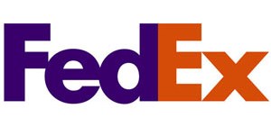
I love logos. But what I love more than logos are logos with hidden meanings. Those are the ones I look back on again and again, because they reveal an extra layer, one that makes me think about the organization the logo represents. Take a look at these famous logos. Do you see the hidden meanings? 1. FedEx Looks pretty straightforward, right? Look closely, between the E and the x. See the arrow created by the white space? Pretty clever, eh? 2. Toblerone Sure there’s a mountain, but do you see the hidden bear? 3. Goodwill At first glance, you might see half a smiley face. But look closely, and you’ll see that the smiley doubles as the letter ‘g.’ 4. Yoga Australia Typical yoga pose, though this one forms the shape of Australia. 5. Amazon We’ve all been to amazon.com, to buy everything from books to toilet paper. That’s because Amazon has it all, from A to Z, as shown by the arrow, which also doubles as a smile. So the next time you come across a logo, take a second look. Maybe you’ll find some hidden layers of meaning waiting to be...
by Annie | Mar 29, 2010 | Adchievements, Logoland
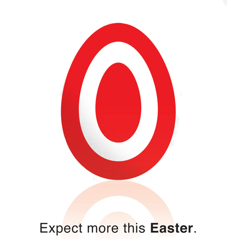
Check out Target’s Easter ad. Simple, straightforward, and memorable. The subtle but distinct variation on Target’s logo represents the iconic egg used to symbolize rebirth on Easter, and the faint reflection adds dimension to the otherwise flat logo. Great design is in the details, and Target has definitely mastered the...
by Annie | Feb 11, 2010 | Logoland
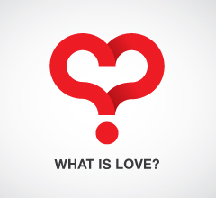
Ah, Valentines Day. According to the Greeting Card Association, over 1 billion valentine cards are sent each year. That makes Valentines Day second only to Christmas in terms of largest card-sending holidays. But hearts aren’t just for Valentines Day. Check out some logos that successfully incorporate hearty sentiments...