by Annie | Oct 28, 2011 | Game Design
The purpose of developing MotionMaze and Pop & Dodge within such rapid production cycles (2-3 weeks each) was to learn as much as possible as quickly as possible. And boy, have we learned some valuable lessons. Lesson 1: This is new. One of the most eye-opening experiences came at a playtest session we did with elementary school kids. We handed them the iPod, and most kids immediately sat down, tapping through the screens, then trying swipe and tilt. We realized that our main mechanics consist of unexpected controls, so we must spell e-v-e-r-y-t-h-i-n-g out so the player understands this new experience. Lesson 2: Give people a reason to jump. People like to play games sitting down. It’s become the norm, and frankly, after a long day, who wants to have to do physical activity to play a game? The game has to be playable on a basic level without physical controls but provide an added layer of powerful incentives to lure the player to get out of their comfort zone and move around. If you tell a player to jump, they might do it once or twice, quickly getting bored or tired. If you provide motivation to jump, players will stay on their feet and soon forget they’re actually jumping. Lesson 3: Make sure it works. Duh, right? Well, with physical activity, movement detection isn’t always reliable. Everyone moves differently and interacts with iDevices in different ways. After going through rounds of testing full of over- and under-registered movement, we’ve realized the immense value of creating reliable movement detection. Players expect it, so we should be able to deliver....
by Annie | Oct 3, 2011 | Game Design
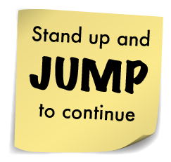
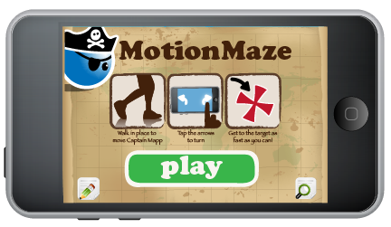
It’s been 5 days since our first game, MotionMaze, made it out onto the App Store. And within those few days, we’ve already learned so much about our audience, our capabilities, and ourselves. Clarity vs. Simplicity It’s important to make your interface and overall game experience as streamlined as possible. However, it’s also important to tread carefully between simple and confusing. To keep our main interface simple, we included icon buttons without text. One button was for feedback, the other for options. Though this was clear to us, users found this frustrating. When they needed options, they couldn’t find the button for it. And when they tapped the feedback button that led them away from the game, it was often out of curiosity. Moving forward, we will be sure to include enough text to ensure that the player experience is clear while the interface remains clean. Wait, how does this work? 3…2…1…Go! The time starts ticking, and you start frantically tapping the screen. When that doesn’t work, you try swiping, then tilting. We knew when we started creating this game that it would be different from typical games in the App Store. However, we failed to include enough measures to help ease our players into this new experience. Even though we included instructions and diagrams on the main screen and in the pause menu, they were easy to skip. Few players realized they needed to stand up to play the game, and even after being told to jog in place, many still needed a demonstration before fully grasping what they needed to do. Moving forward, we realize that with...