by Annie | Feb 18, 2010 | Typographically Speaking
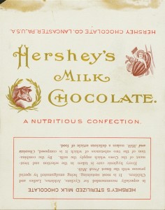
Who doesn’t love a Hershey’s bar? The creamy milk chocolate is a must-have for any s’mores sandwich and makes a delightful anytime snack. Hershey’s bars were originally wrapped in white paper with scripty gold lettering. Through the years, dark paper was introduced due to an accusation of copyright infringement, and the iconic block lettering was added. Hershey bars were just 5 cents through the end of 1969. Then, they doubled to 10 cents, and the price has been climbing ever since. Notice on the earlier versions that the chocolate bar was dubbed a “nutritious confection” and a “nourishing food.” Those labels were dropped in the 1930s, and after the nutrition label was added in 1973, no one can claim that the bar is very nutritious. It is, however, undeniably...

by Annie | Dec 21, 2009 | Typographically Speaking
Most articles, reports, and papers we read these days are written in 12-pt. Times New Roman. The few creative ones might venture into Arial or, God forbid, Comic Sans. In the old days, type designers cast fonts in lead, or, more recently, in wood. Back then, typography was a specialized occupation. However, the Digital Age has made type design available for anyone with computer access. If you’re ready to take a crack at type design, head over to FontStruct, which features a free font-building tool. Arrange geometrical shapes in a grid to create your own font. Then download your new font and use in any Mac or Windows application. Give it a...