
by Annie | Dec 24, 2009 | Adchievements, Typographically Speaking
When I decided to venture into the field of digital design, my mom’s main worry was that my college degree in psychology was completely unrelated to design. But in fact, the two fields are inextricably intertwined. Color and typography both have emotional underpinnings, and the subliminal messages behind logos and ads often play mind tricks on uninformed consumers. Take menu design, for example. Did you know that restaurants (along with the menu engineers and menu consultants they hire) spend hours and hours painstakingly obsessing over every element on their menus? Pictures, no pictures, size of text, fonts, colors, adjectives, price display, and spacing are just the tip of the iceberg when it comes to designing an effective menu. Researchers have found that the following can subconsciously massage consumer wallets: 1. Remove dollar signs and cents from prices. Dollar signs remind people of money they don’t want to spend. Cents remind people of pennies they don’t want to deal with. 2. Choose the right colors. Apparently, red and blue stimulate your appetite, while gray and purple make you feel full. 3. Use descriptive menu labels. Packing in adjectives, geographic markers, and even relative names (e.g., Aunt Sally’s Famous Potato Salad) will make dishes sound more appealing. 4. Remove pictures. Imagination always trumps even the best picture a camera can take. 5. Employ the art of contrast. Place an expensive item at the top of the menu, and suddenly everything else seems more affordable. So you decide: which restaurant would you spend more money at? Restaurant A: Restaurant B: For more information on the psychology behind menu design, check out...

by Annie | Dec 21, 2009 | Typographically Speaking
Most articles, reports, and papers we read these days are written in 12-pt. Times New Roman. The few creative ones might venture into Arial or, God forbid, Comic Sans. In the old days, type designers cast fonts in lead, or, more recently, in wood. Back then, typography was a specialized occupation. However, the Digital Age has made type design available for anyone with computer access. If you’re ready to take a crack at type design, head over to FontStruct, which features a free font-building tool. Arrange geometrical shapes in a grid to create your own font. Then download your new font and use in any Mac or Windows application. Give it a...

by Annie | Dec 14, 2009 | Adchievements, Typographically Speaking
It’s amazing how the simple ideas stick with us the longest. Many designers use text in interesting ways in their designs. Some use big bold text, others use scripty and flowy text. Even the fourth graders I taught could change fonts, sizes, and colors. However, the designs that we remember most are those in which the text blends seamlessly into the image. Image relies on text, and text relies on...
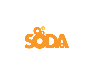
by Annie | Dec 11, 2009 | Logoland, Typographically Speaking
Anyone can play around with letters, but a great designer arranges, changes, and adds to letters so as to reveal the essence of the message. Here are some straightforward logos that convey meaning in powerful...

by Annie | Dec 9, 2009 | Typographically Speaking
If a picture is worth 1,000 words, using text as image must be worth 1,001. I first learned about the technique of using text as image in college during a book arts class. Prior to that, I hadn’t given typography a second thought, blindly using double-spaced 12-pt. Times New Roman for every paper I’d written. Teachers get cranky otherwise. The subject of the memoir I wrote for my book arts class was my journey through childhood and adolescence as a fat kid. My professor pushed me at every step to consider all design decisions carefully in order to communicate the message of my story as clearly and effectively as possible. While reading through A History of Graphic Design during one long caffeine driven night, I was blown away by the thought that text could be used as image. Since kindergarten, I’d been taught the names and sounds of the letters, how to combine the letters to form words, and how to link words to form sentences. During all that, not once did I stop to consider the shapes of the letters themselves. After all, the alphabet is essentially a gallery of 26 pictures that were eventually assigned to sounds. With that new revelation in mind, I decided to use text as image as the underlying design theme of my book. As I played around with typography, text placement, spacing, and letterforms, I rediscovered the beauty of letters and text, approaching them with the same wonderment and curiosity that I had as a preschooler. Through my study of typography, I learned that effective synthesis of text as image and the...

by Annie | Nov 30, 2009 | Adchievements, Illustration Station, Logoland, Typographically Speaking
Looking for the perfect gift for the designer in your life? Here are some ideas to help them show off their inner design geek. Gift Idea #1: An invisible T-shirt for the disappearing designer Gift Idea #2: Coffee tastes better in your favorite Pantone mug Gift Idea #3: Foster HTML peace with this “begin love, end hate” cap Gift Idea #4: Make banana the new apple by showing off this tile coaster Gift Idea #5: Use Adobe app pillows to start a designer pillow fight Gift Idea #6: Make every photo on your fridge look Photoshopped Gift Idea #8: When all else fails… Happy shopping, and whatever you buy, make sure it’s well...