by Annie | Feb 11, 2010 | Logoland
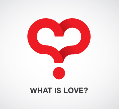
Ah, Valentines Day. According to the Greeting Card Association, over 1 billion valentine cards are sent each year. That makes Valentines Day second only to Christmas in terms of largest card-sending holidays. But hearts aren’t just for Valentines Day. Check out some logos that successfully incorporate hearty sentiments...
by Annie | Jan 24, 2010 | Logoland
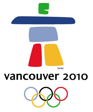
I’ve never been a big fan of Valentine’s Day, so I was extremely excited when I realized that this February would be filled not with pink doily hearts, but rather with ski jumps, figure skating, and curling. Miniature cupids, make way for the Winter Olympics, beginning with the opening ceremony on February 12th in Vancouver. This year, couples can bond over nail-biting triple lutzes and 70mph ski maneuvers. No cheesy, sentimental cards needed. The Vancouver 2010 emblem was chosen from among 1,600 entries. It represents Ilaanaq, the Inuit word for friend, and features five stone-like formations in vibrant colors from the Olympic logo, nature, and Canadian pride. Here’s a look back at Winter Olympic emblems from the last 30...
by Annie | Jan 12, 2010 | Logoland, Typographically Speaking
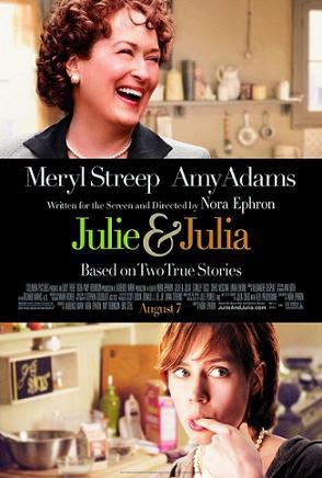
I recently watched the book-turned-movie Julie and Julia, a very fun movie based on an inspirational story that brings together modern day young professional Julie Powell with famous TV chef Julia Child. The title screen of the movie incorporates a scripty ampersand, representing the unity of time periods, locations, and styles. So I got to thinking, where did the ampersand come from? According to Wikipedia, the word ampersand comes from the phrase “and per se and,” meaning “and [the symbol which] by itself [is] and.” I recall hearing in high school Latin class that the ampersand comes from the Latin word “et,” meaning “and.” In fact, you can trace the evolution of the symbol back to Old Roman cursive, in which the letters E and T were sometimes written together. These days, you can find the symbol practically anywhere: 1. In logos 2. In clothing and accessories 3. Around the house What was once a quick shorthand symbol has now become an icon of class, unity, & enterprise. Bravo, ampersand....
by Annie | Dec 29, 2009 | Logoland, Typographically Speaking
When you think of the ABCs, what’s the first thing that comes to mind? Pre-K, the ABC song, Sesame Street? Most likely, art and design don’t immediately pop into your head. And who can blame you? Most people first encounter the ABCs in early childhood, strange symbols printed on paper or posters next to illustrations – the “real” art. The letters are rarely studied for their own artistic value; rather, they are strung together in words and sentences to describe other pieces of art. A recent report published by the University of California, San Diego, suggests that the average American consumes 100,000 words of information in a single day. That’s not hard to imagine considering we can so easily access television shows, video games, emails, and text messages – often simultaneously! Most adults can read a word in less than a second. In fact, many words, such as “the” and “dog” are memorized in early elementary school as sight words, so readers don’t actually read them so much as recognize them. In a world that moves so fast, it’s often difficult to stop and appreciate the simple beauty behind the letters we read and write every day. That’s where letterforms come in. In typography, letterforms refer to the study and design of individual letters. Letterforms help to highlight the aesthetic value of the lines, angles, curves, and shapes that make up letters and are often linked to emotions and hidden meanings, hence their importance in advertising. So the next time you scan an article, pass by a store sign, or read a book with your kids, stop and take...

by Annie | Dec 23, 2009 | Logoland
When it comes to logos, are you a believer in evolution or, perhaps, intelligent design? Just as people change and technology develops, corporations evolve over time. Companies often adapt their logos to stay in touch with their clients, but too much change can alienate their audience and change their brand identities. Though logos start out as just sketches on paper, they eventually embody the values and vision of the organizations they represent, so even minor tweaks here and there can cause lasting ripples. Let’s take a step back in time and take a look at the evolution of some logos we all know and love. 1. Apple 2. Firefox 3. Starbucks 4. Volkswagen 5. Canon 6. IBM 7. Wal-Mart 8. Morton Salt 9. UPS 10....
by Annie | Dec 11, 2009 | Logoland, Typographically Speaking
Anyone can play around with letters, but a great designer arranges, changes, and adds to letters so as to reveal the essence of the message. Here are some straightforward logos that convey meaning in powerful...